ABOUT INVESTCLOUD
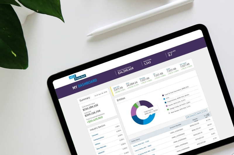
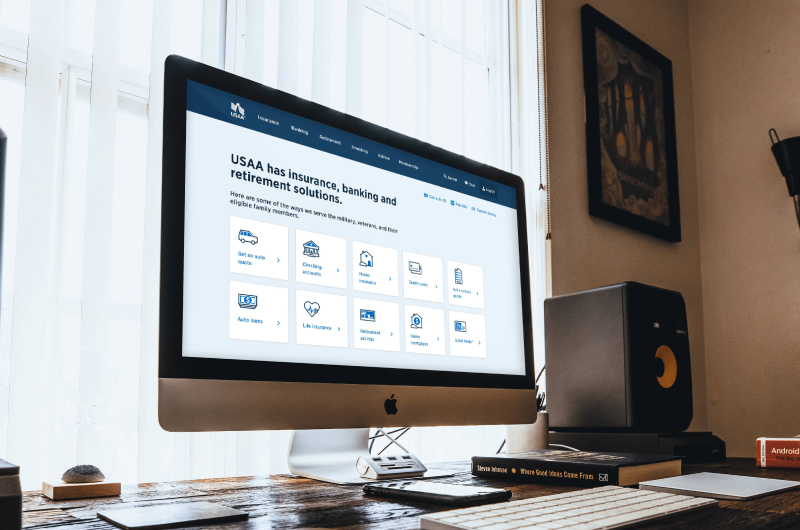
InvestCloud is a California-based financial digital solution. They create beautifully designed client experiences and intuitive operations solutions using their ever-expanding library of digital modular apps for the financial industry. Including their inhouse CRM, data warehousing, accounting, wealth management, etc. They have a growing list of 550+ clients and over & 6.3 billion assets on their platform.
THE CHALLENGE
InvestCloud possesses a unique development approach, and it was the first company I encountered that uses programs to write programs. This enabled them to quickly ramp up and launch new client portals within months instead of years. The challenge in organizing the component library was aligning the design components with the auto-generated code. Auditing the existing components in the development database became the biggest challenge. To understand the development process, we underwent onboarding courses for new developers. This enabled us to launch and inspect the elements more effectively and begin standardizing them.
Once the audit was completed, we were able to better define the scope and goals for our updated system. Based on our audit, we identified the following goals as essential for the company:
Project Goals:
- Ensure adaptability and usability across all our products.
- Serve as a blueprint for client libraries.
- Standardize all our UI elements.
- Reduce turnaround time for new screens and products.
- Maintain design consistency across all products.
- Improve documentation for all product development.
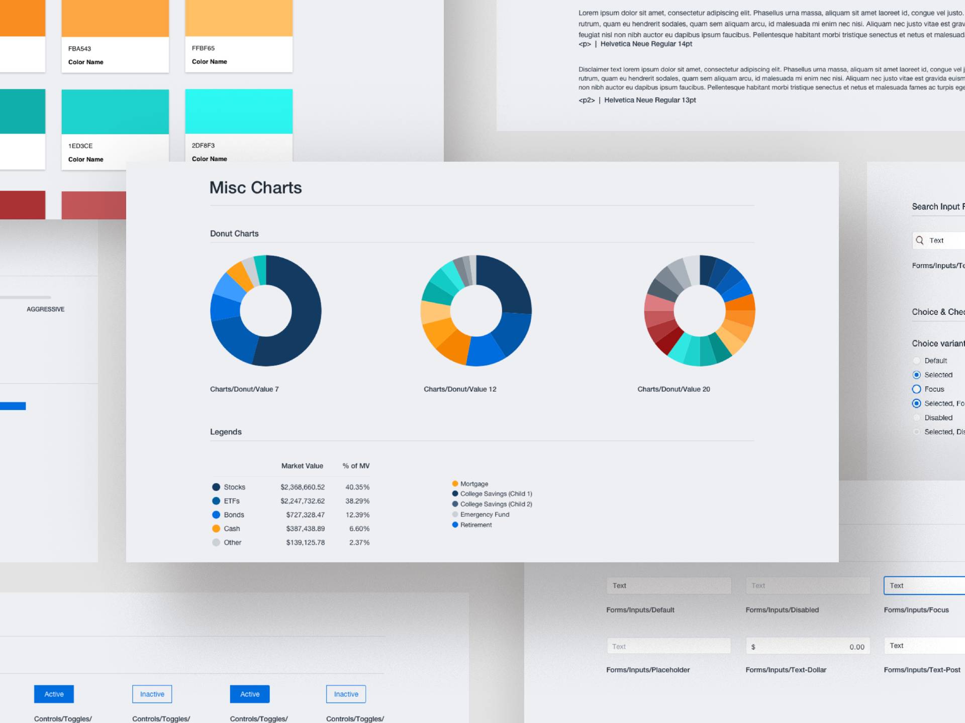
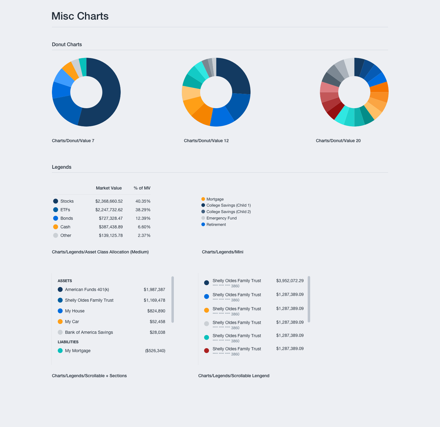
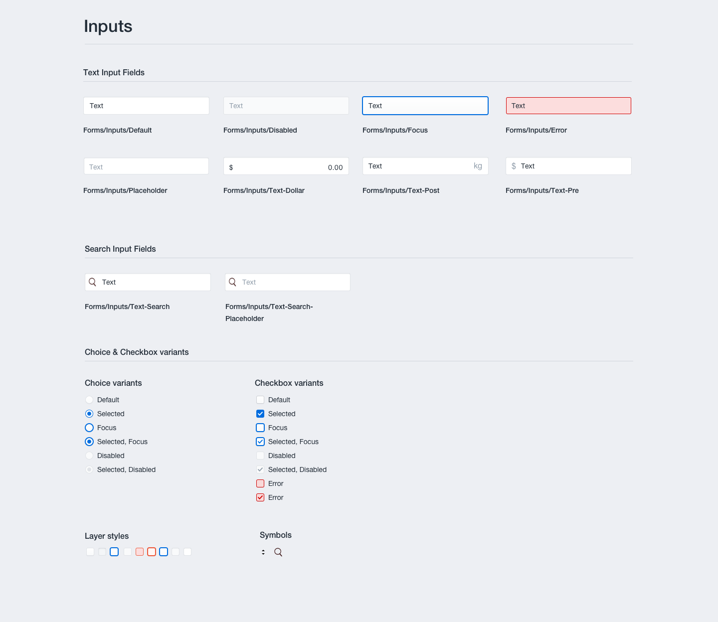
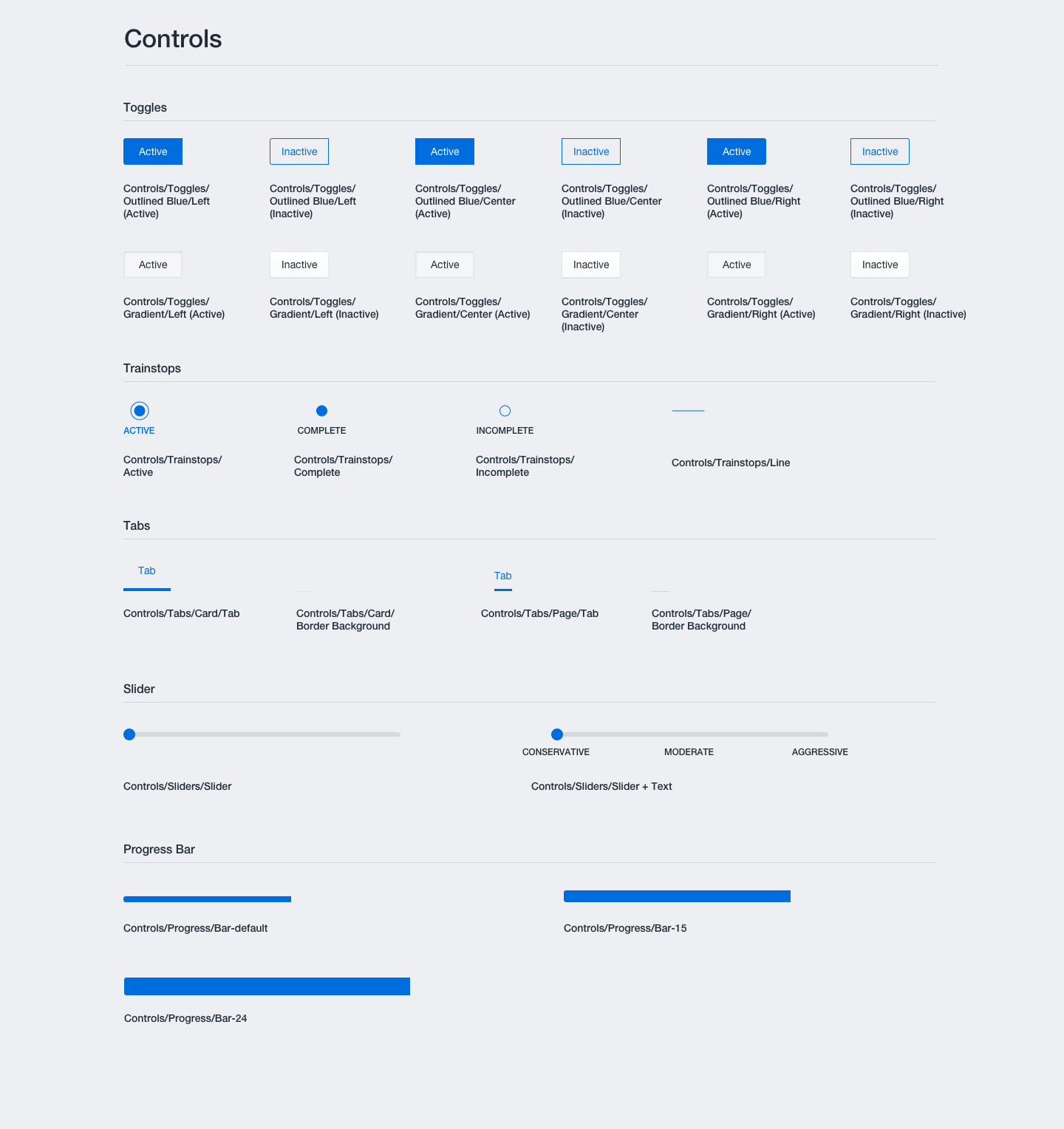
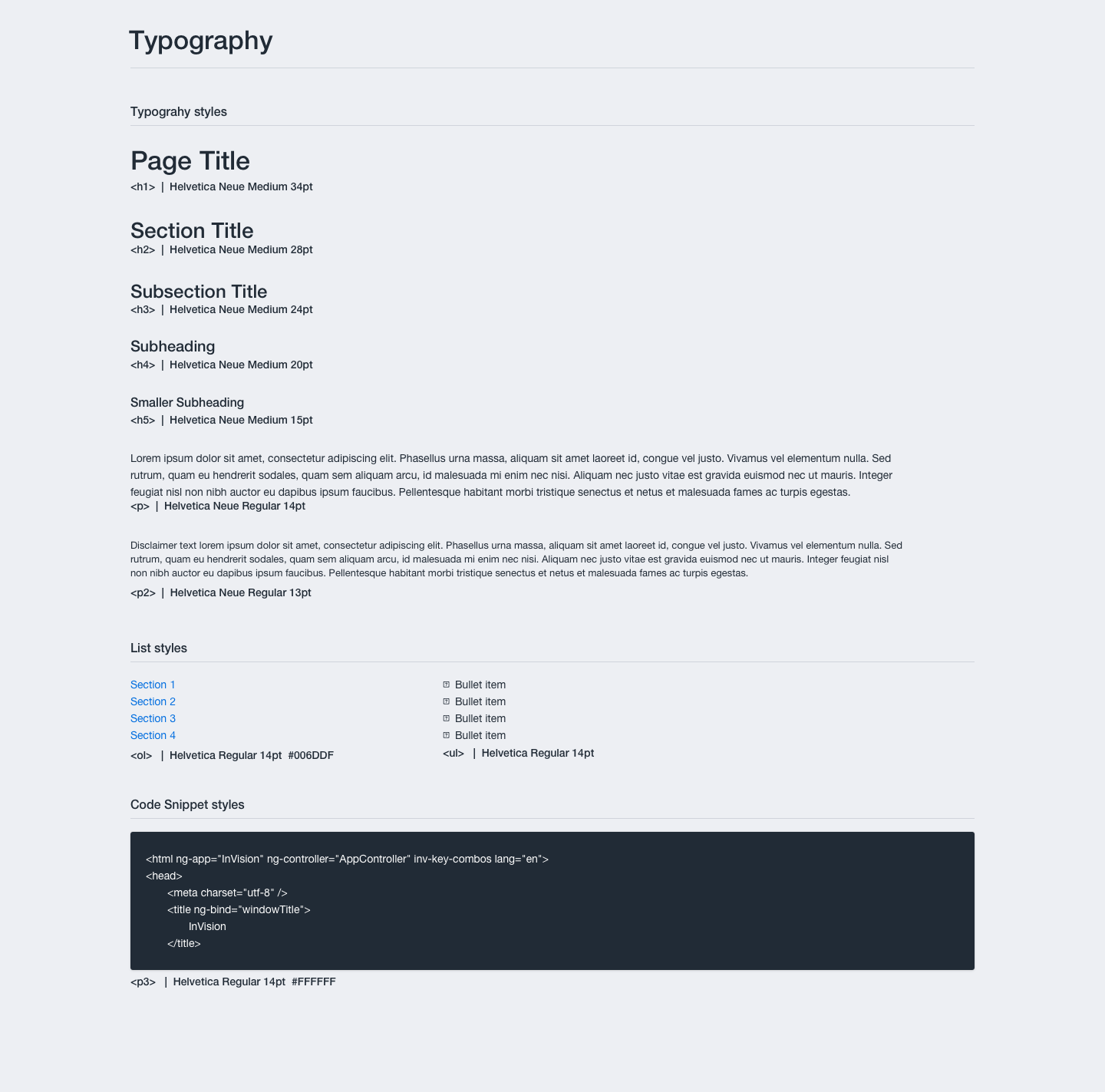
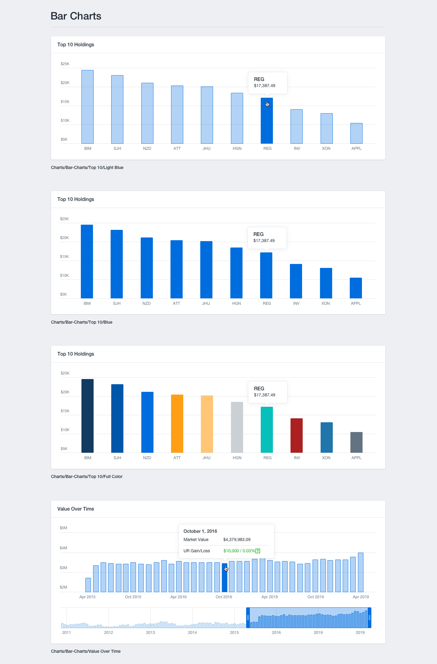
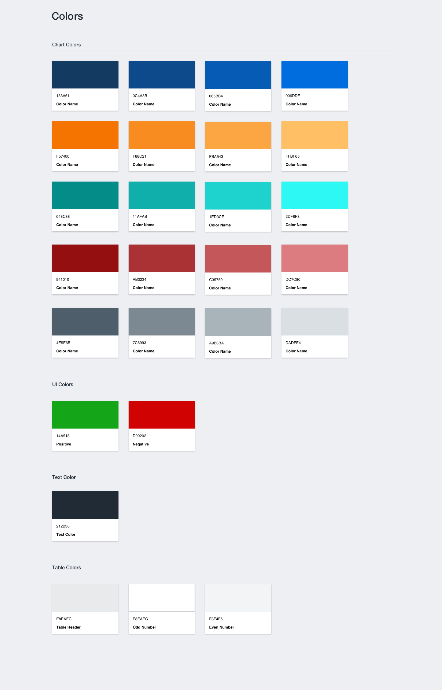
We began by identifying the core UI components that would form the foundation of our design system. These components included buttons, forms, navigation menus, cards, modals, typography styles, color palettes, charts, icons, and more. We considered the components that were most frequently used across our different client products or platforms. We also took into account A11y accessibility, such as color contrast for text and background, keyboard navigation, screen reader compatibility, and support for screen reader technologies.
The second phase involved accounting for different screen breakpoints. We needed to define how the components should adapt and behave across various screen sizes and devices to ensure a consistent experience across all devices.
OUTCOME
I am a strong advocate for a well-thought-out design system. It is an ongoing work in progress that saves a lot of headaches during projects. I have found it to be even more beneficial when working in teams. Due to our tight deadlines, InvestCloud taught me the importance of design systems and building a design library with each project. This approach allowed us to exponentially scale our design efforts.
