INTRO TO MICROSOFT
Microsoft, a globally renowned technology company, has played a pivotal role in shaping the digital landscape since its inception in 1975. As one of the world's largest software corporations, Microsoft has consistently delivered innovative products and solutions that have revolutionised the way we work, communicate, and interact with technology. With a diverse portfolio encompassing operating systems, productivity software, cloud services, gaming, and hardware devices, Microsoft has established itself as a leader in multiple domains. From the ubiquitous Windows operating system to the widely adopted Office productivity suite, and the powerful Azure cloud platform to the Xbox gaming ecosystem, Microsoft's influence permeates various aspects of our modern digital lives. By consistently pushing boundaries and embracing technological advancements, Microsoft has remained at the forefront of innovation, empowering individuals and organisations across the globe to achieve more and unleash their full potential.
THE CHALLENGE
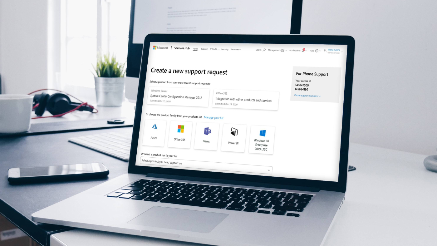
When I joined Microsoft on a six-month contract, my task was to design a new issue management portal specifically tailored for smaller business customers. The existing portal was originally designed for large companies with a significant number of Microsoft licenses, making it economically unviable for smaller clients. To address this, the new portal needed to cater to the needs of smaller businesses by offering self-help resources instead of dedicated support staff. The design direction would align with the larger issue management portal, utilizing the same component library.
One of the primary goals of the project was to streamline the flow of information to efficiently resolve issues. This required eliminating unnecessary delays and improving the speed at which issues could be addressed and resolved.
THE PROCESS
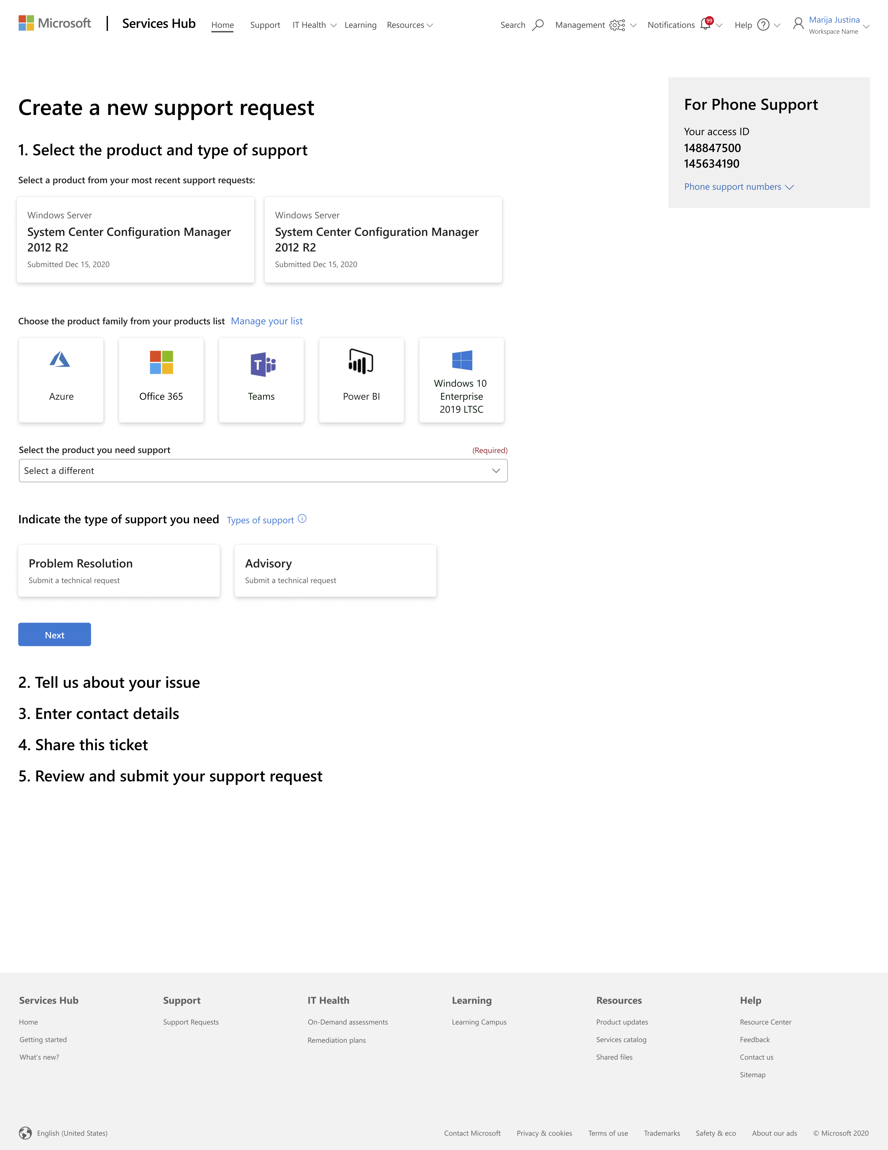
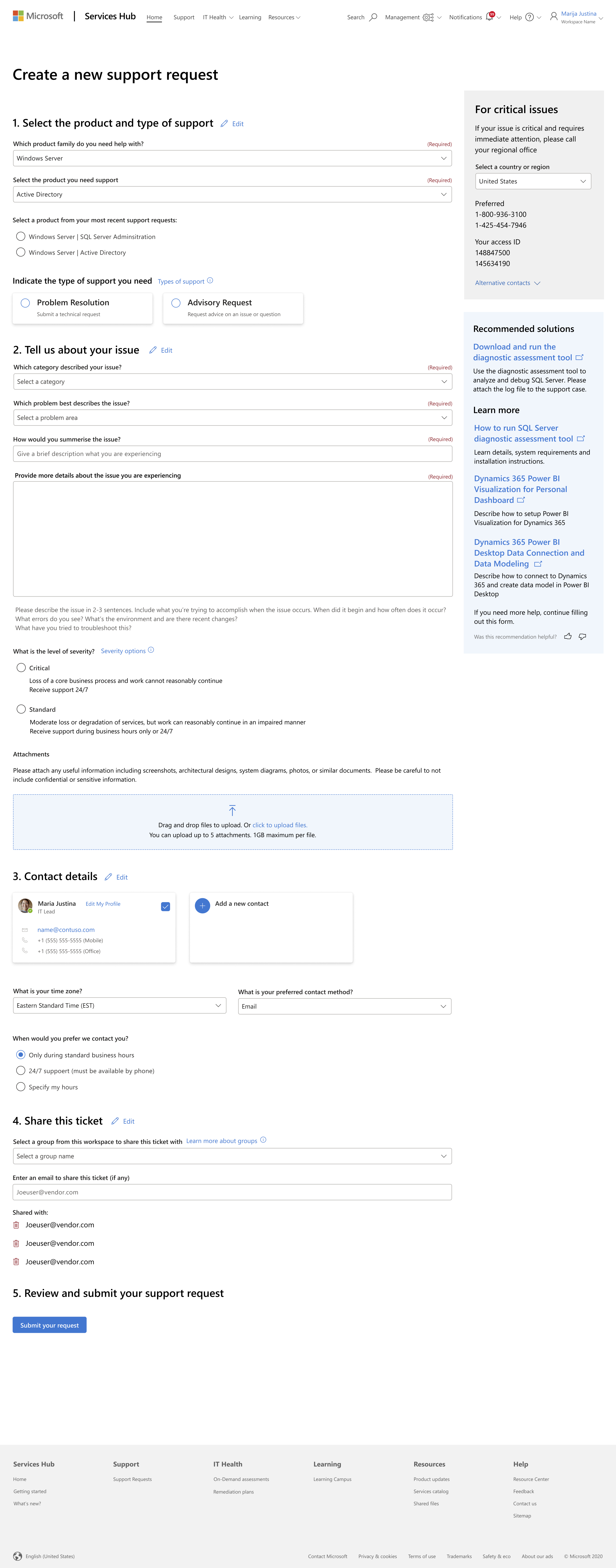
To kickstart the process, I thoroughly analyzed user research and identified the pain points of the customers. This information guided me in creating a series of wireframes that mapped out the screen flow. By carefully auditing the required input fields for each step, the team ensured a comprehensive and streamlined user experience. The wireframes were presented to project stakeholders and the development team, with the research team conducting user interviews to validate the alignment with customer pain points. Our aim was to make the process feel accessible and manageable, avoiding overwhelming users with lengthy and confusing ticket screens. Given that this was a new product offering, customer needs were at the forefront of our design decisions.
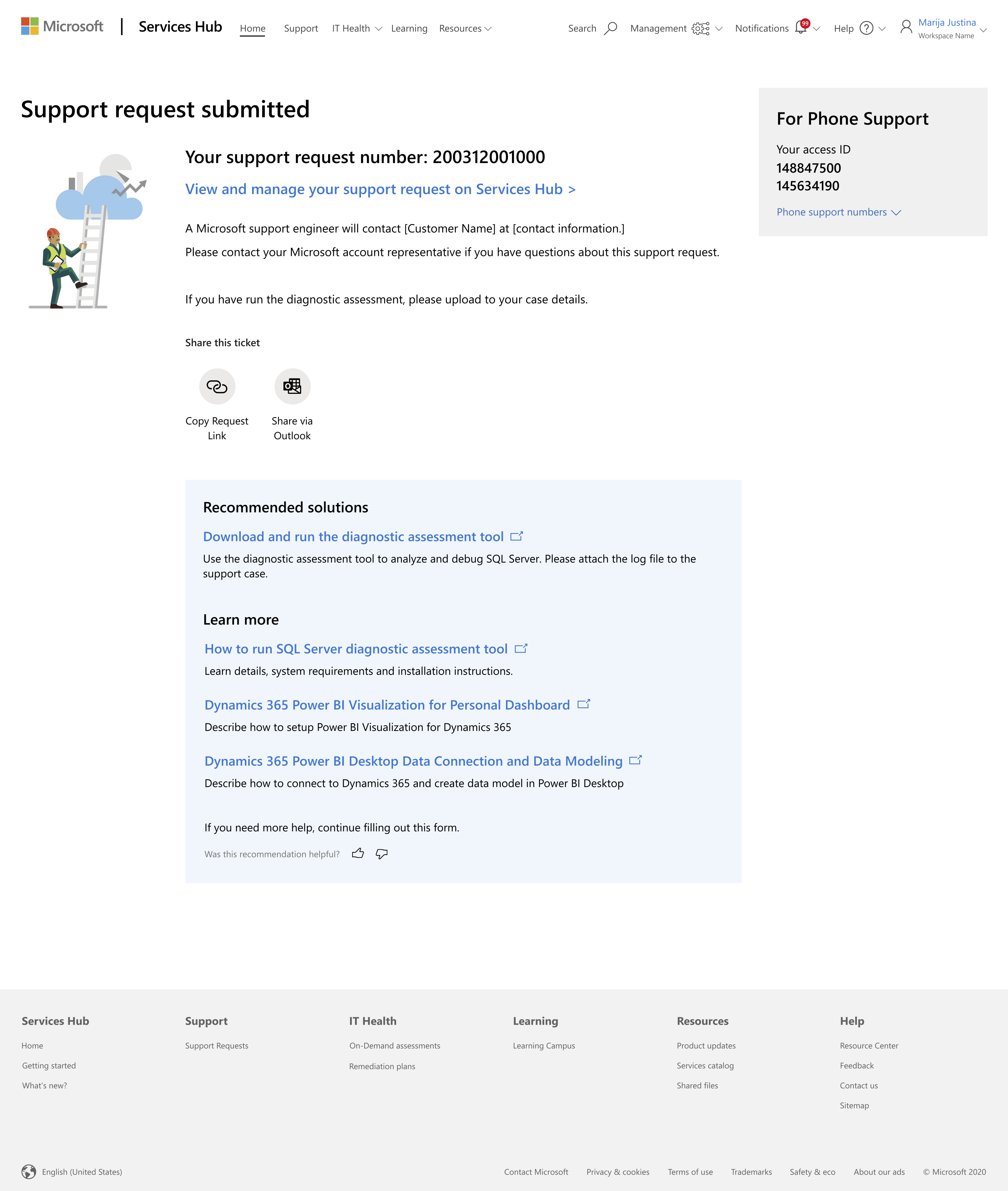
Once the initial wireframes were approved, I transitioned to developing high-fidelity designs. Each screen was designed to accommodate different breakpoints for desktop, tablet, and mobile devices. Each phase of the project underwent review and approval by the team of stakeholders before being handed off for development. Leveraging the established component library within the team facilitated an expedient workflow. The project went live towards the end of my contract, receiving glowing reviews from users.
DESIGN SYSTEM UPDATE
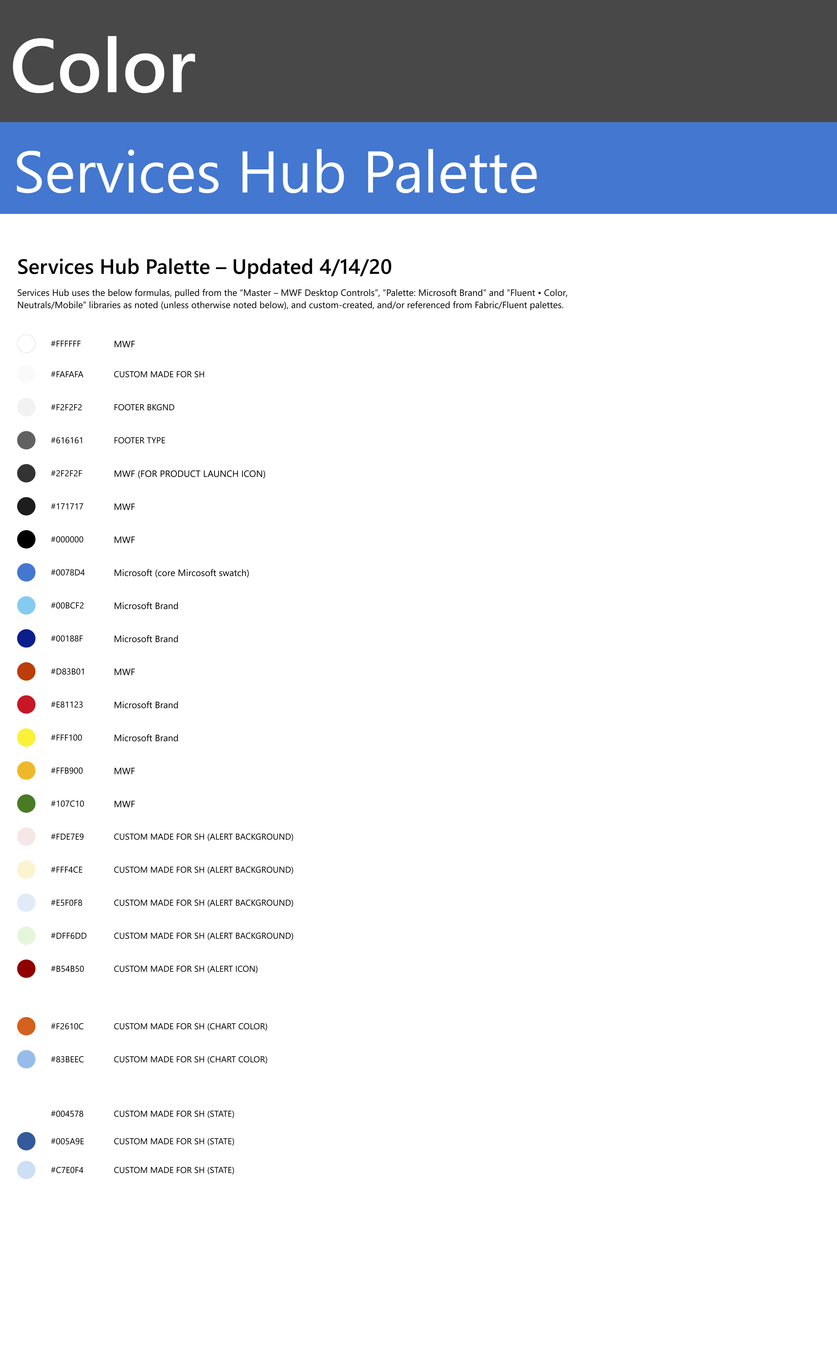
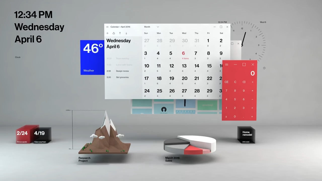
During my contract, the team entrusted me with expanding and enhancing their component library. This expansion included incorporating dark mode and high contrast options to cater to users with low visibility. The component library served as an extension of the One Microsoft Design System, known as Fluent. Microsoft introduced Fluent in 2017 to achieve design consistency across all platforms and screens. The system revolves around five key components: light, depth, motion, material, and scale. Fluent also emphasized the prominence of motion, depth, and translucency effects.
THE CHALLENGE
The challenge in this project lay in updating the existing components in the internal library to align with the Fluent design system.
THE PROCESS
The approach taken for this revamp involved meticulously building out each component in various states (default, focus, error, etc.) and sizes. We conducted accessibility validations to ensure that each component complied with the necessary standards and included appropriate ARIA labels. Additionally, thorough testing was conducted to ensure responsiveness across different screen breakpoints. Once a component was approved, it was updated and shared with the team for implementation.
THE OUTCOME
This project was ongoing until the end of my contract at Microsoft. In those weeks I was able to add in the new color modes, and more accessibility notes.
