ABOUT VROOZI
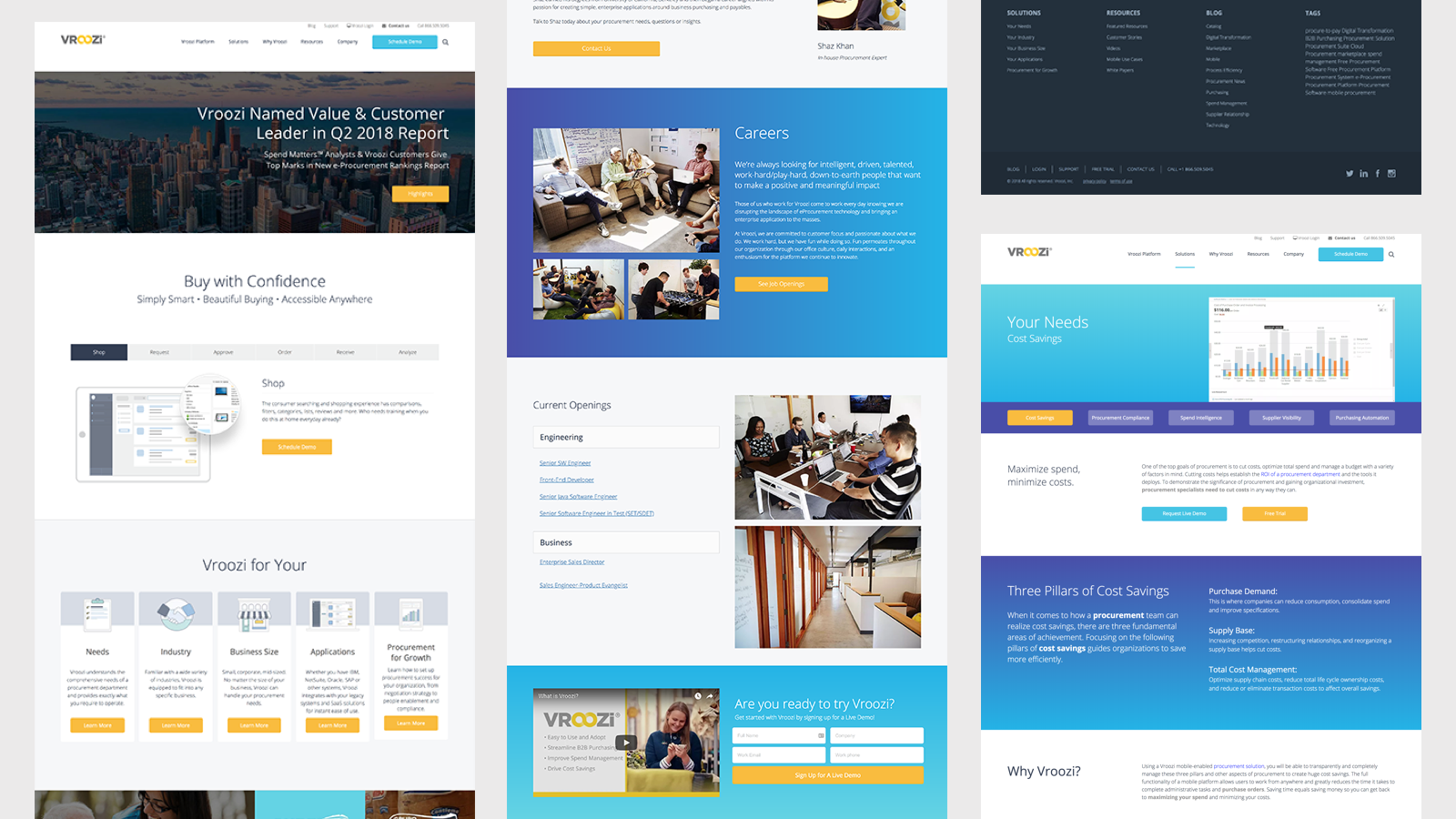
Vroozi is a cloud-based e-procurement platform founded in 2011. Helping companies make shopping for their business effortless, efficient, and enjoyable. Vroozi is pushing mobile first and making their customer experience consistent across all devices. Their aim is to empower their employees, connect with their suppliers and maintain spend visibility from anywhere, anytime. Their platform is marketed B2B to larger buyers in government, healthcare, manufacturing, etc. The platform’s aim is to be as simple as buying something from Amazon, making it customizable to each industry. Their orginal web site is below.
THE CHALLENGE
Vroozi hired me to redesign their marketing site summer of 2018. They were in the process of going through a refresh of their brand and needed a site that felt more modern and consistent. The current site was built in WordPress and had not had a serious refresh for a few years.
Design Goals
- Highlight a consistent call-to-action
- More white space
- Feature the platform in the design more - better stock photos
- A modern and mobile friendly design
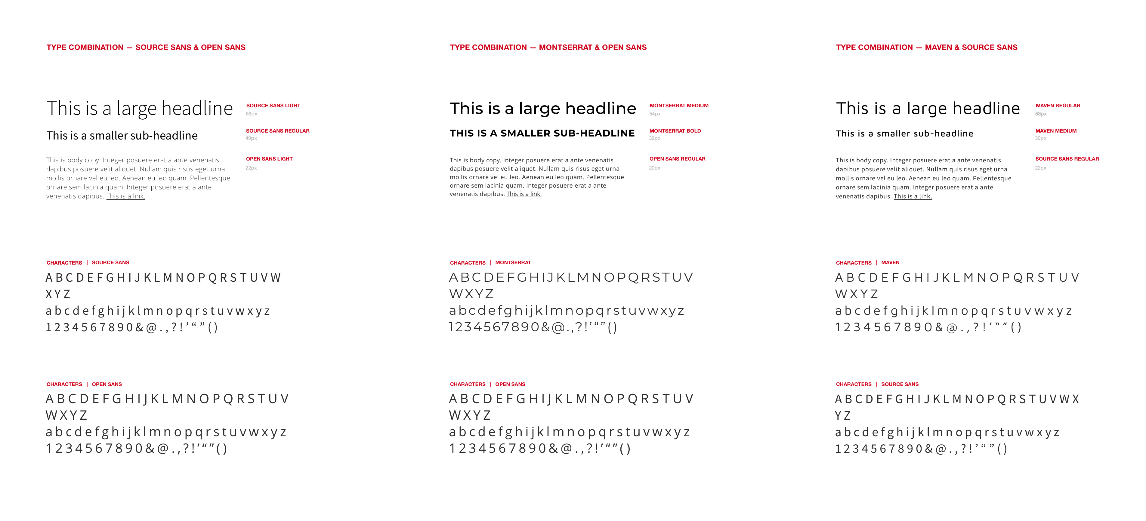
Mobile first was a big factor when redesigning their marketing site. The current site design was not optimized for mobile, still using an image carousel and no consistent call-to-actions. Reviewing the site for the first time I realized we could generate more sales leads by encouraging visitors to sign up for a demo throughout the page. Converting at less than 1%, the current site was not meeting their acquisition goals. We established our design goals for the new site, along with exploring new stock photo options, and typography. We settled on Open Sans for all their < body > tags, while using Roboto for all of their < h > tags.

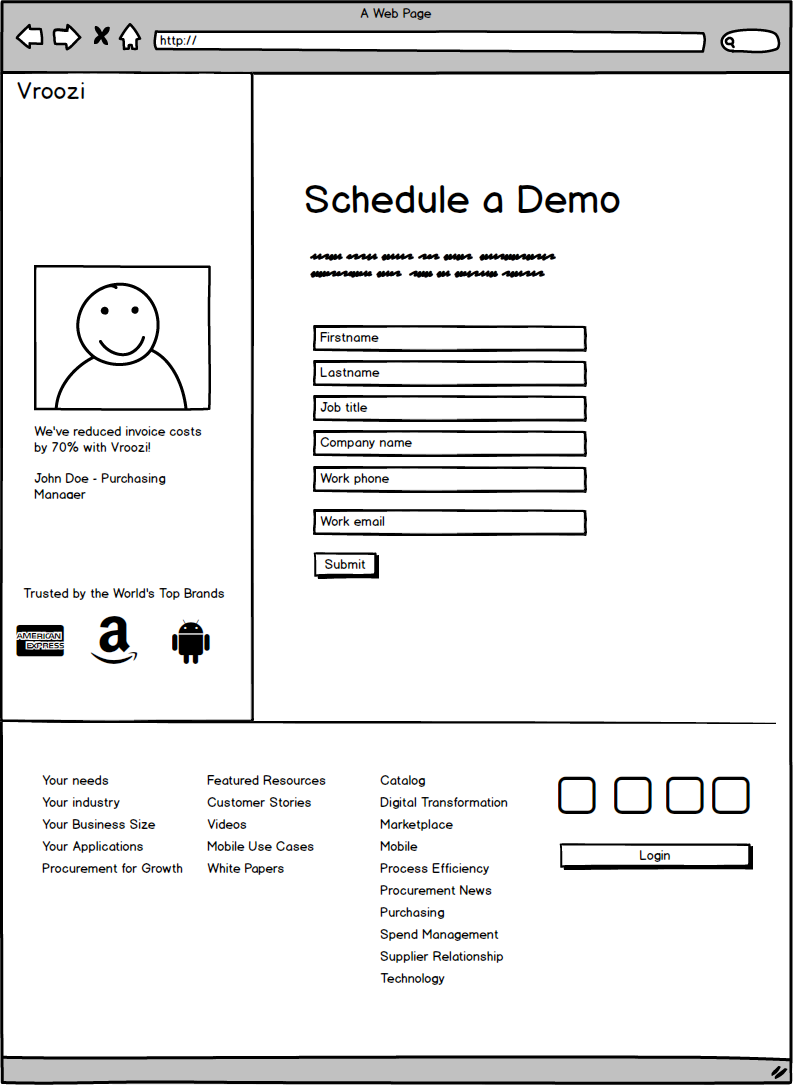
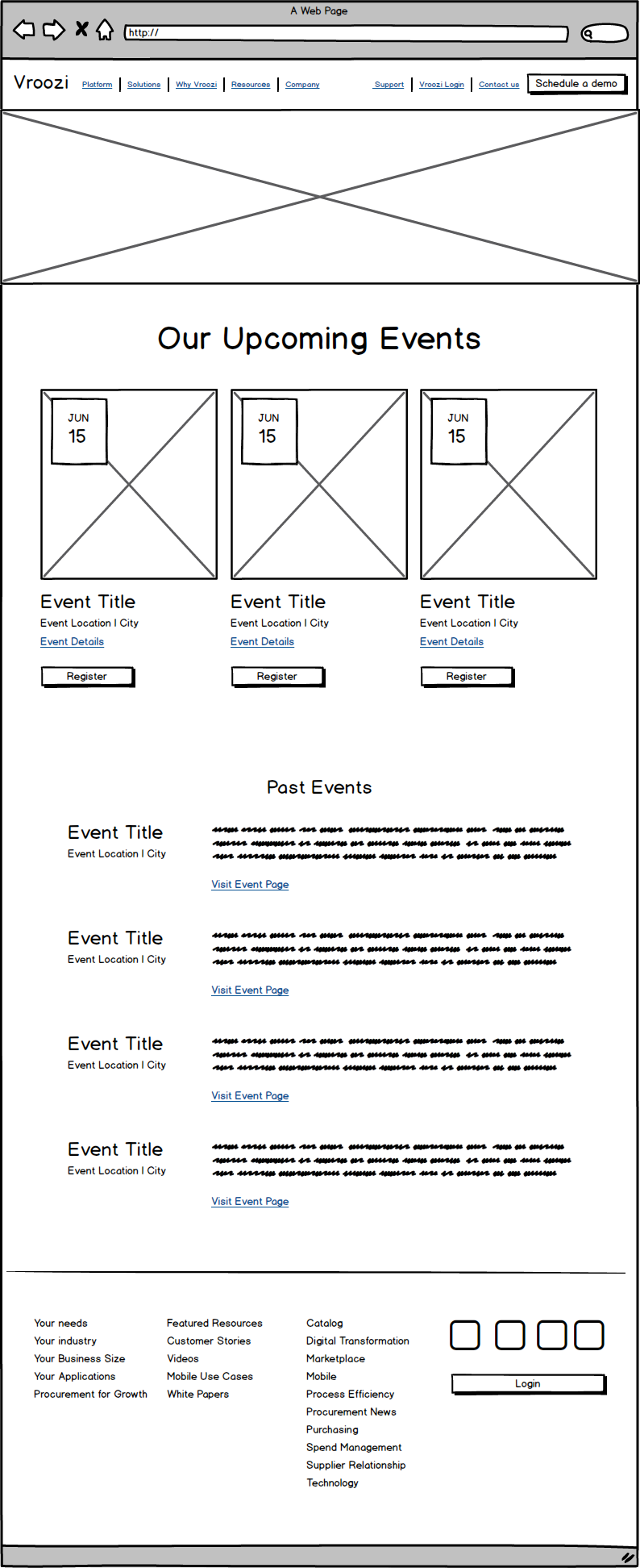
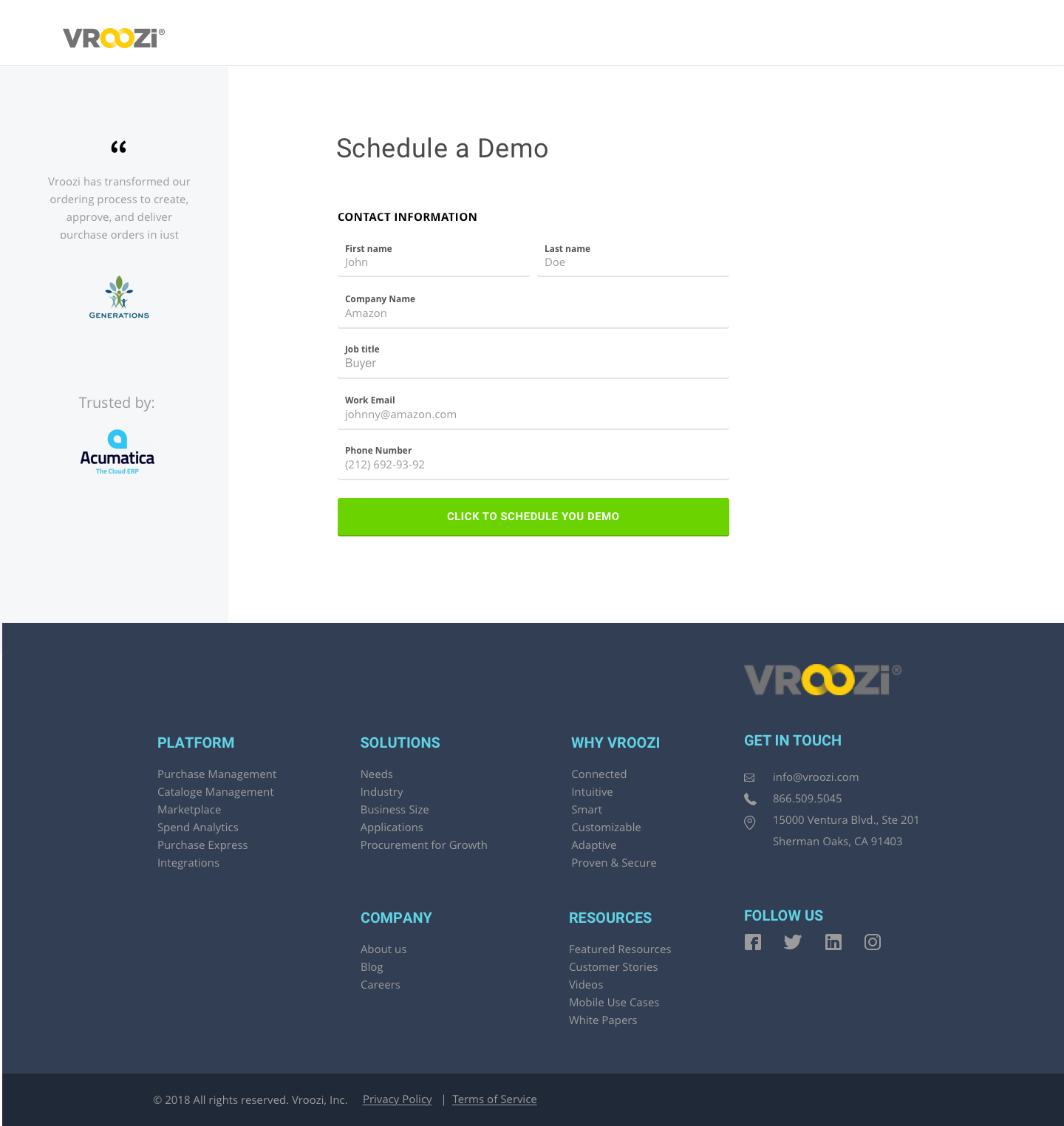
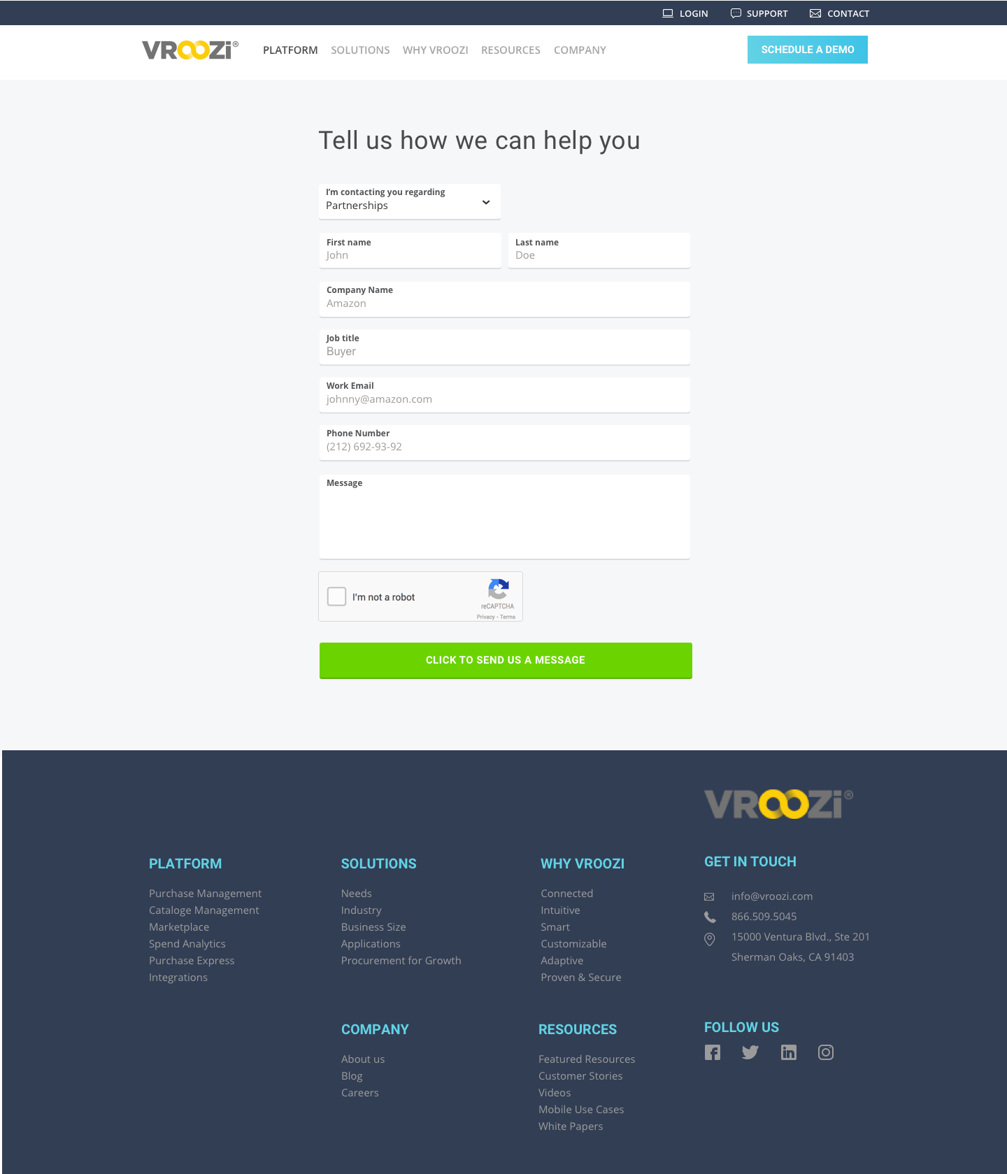
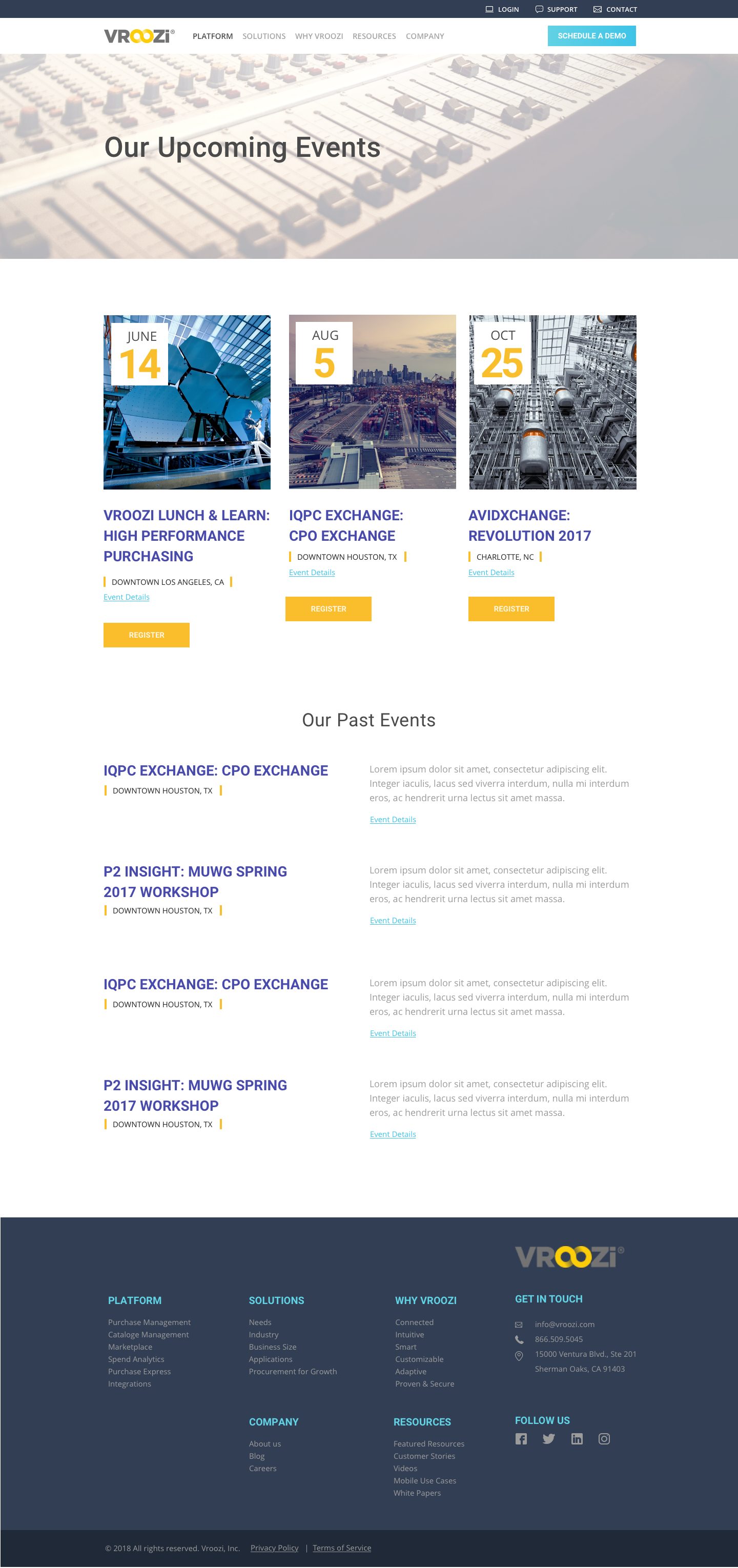
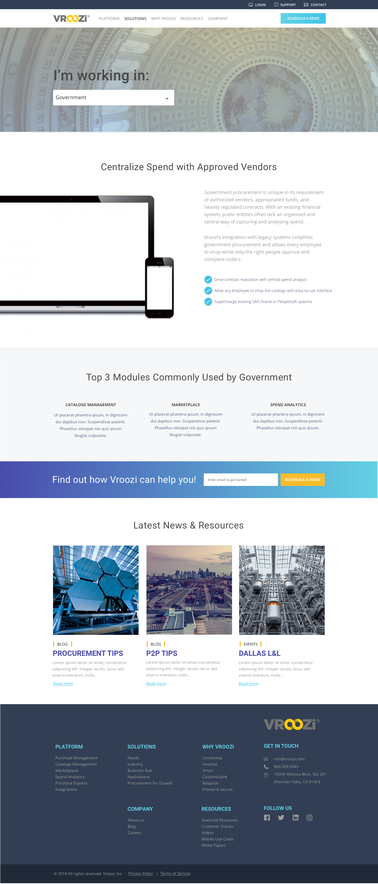
We include more call-to-actions throughout the new page design, prompting the user to sign up for a demo. In the original design it was difficult to find how the user was supposed to contact, or submit a support ticket. Aquisition of new users is typically a marketing site’s number one goal, but not far behind should be caring for the users you have already acquired. To solve that I flushed out the entire contact flow for support, general contact, and signing up for a demo. My approach to the stock photos was a mix of product mockups and lifestyle. I wanted the mockups to be on white to allow the platform to stand out. Instead of full sections having a gradient background, I scaled it back to only accentuate the demo sign-up.
PROJECT CONCLUSION
The project had originally been slated to last 3-4 weeks. Sadly the client had to cut the project short due to budget constraints. I am really proud of the amount of work we were able to accomplish in the 1.5 weeks we had. The designs created established the look and feel for the rest of the site. The client took the design back to their team and work on it internally.
