INTRODUCTION TO DOCUSIGN
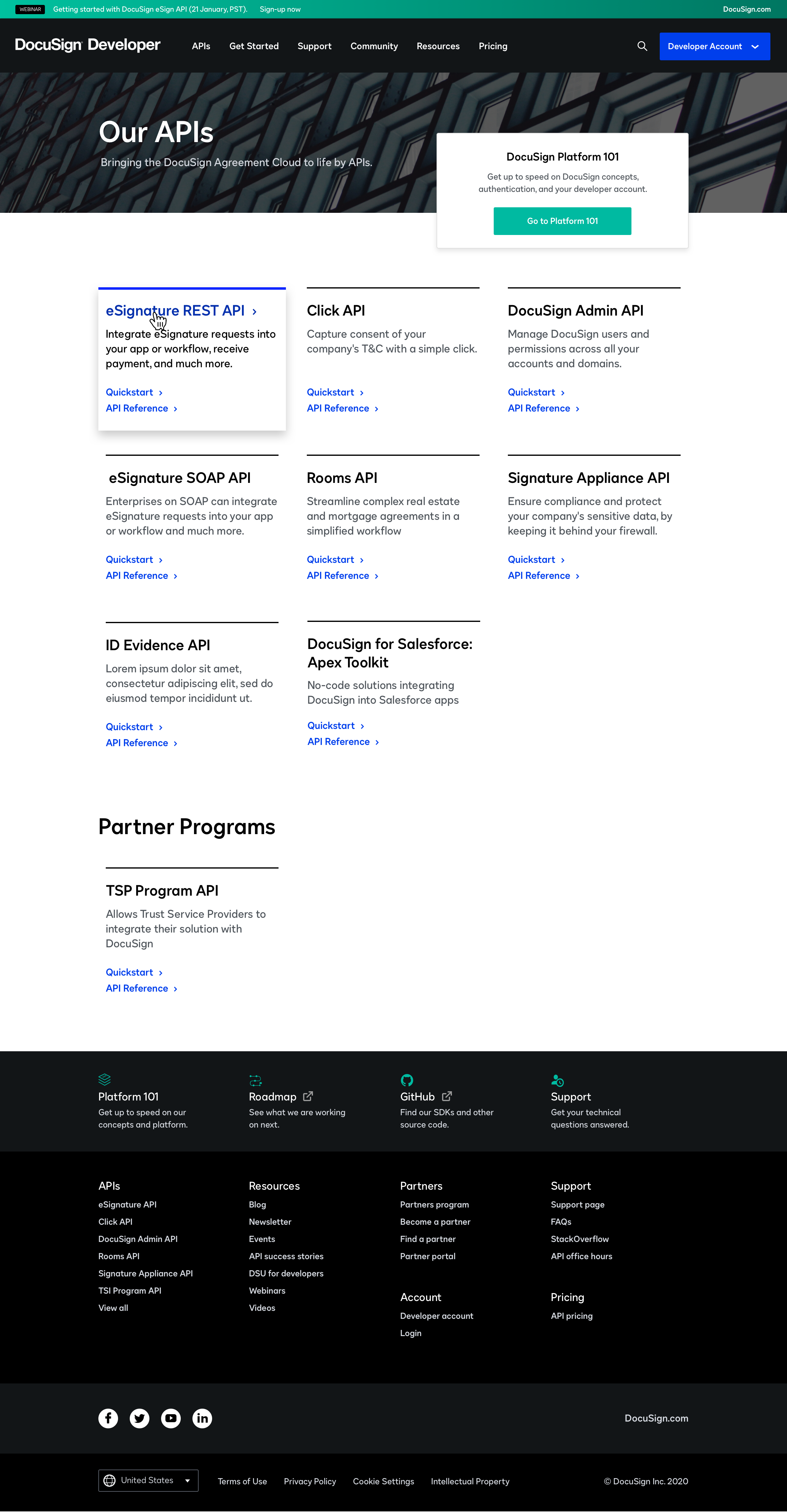
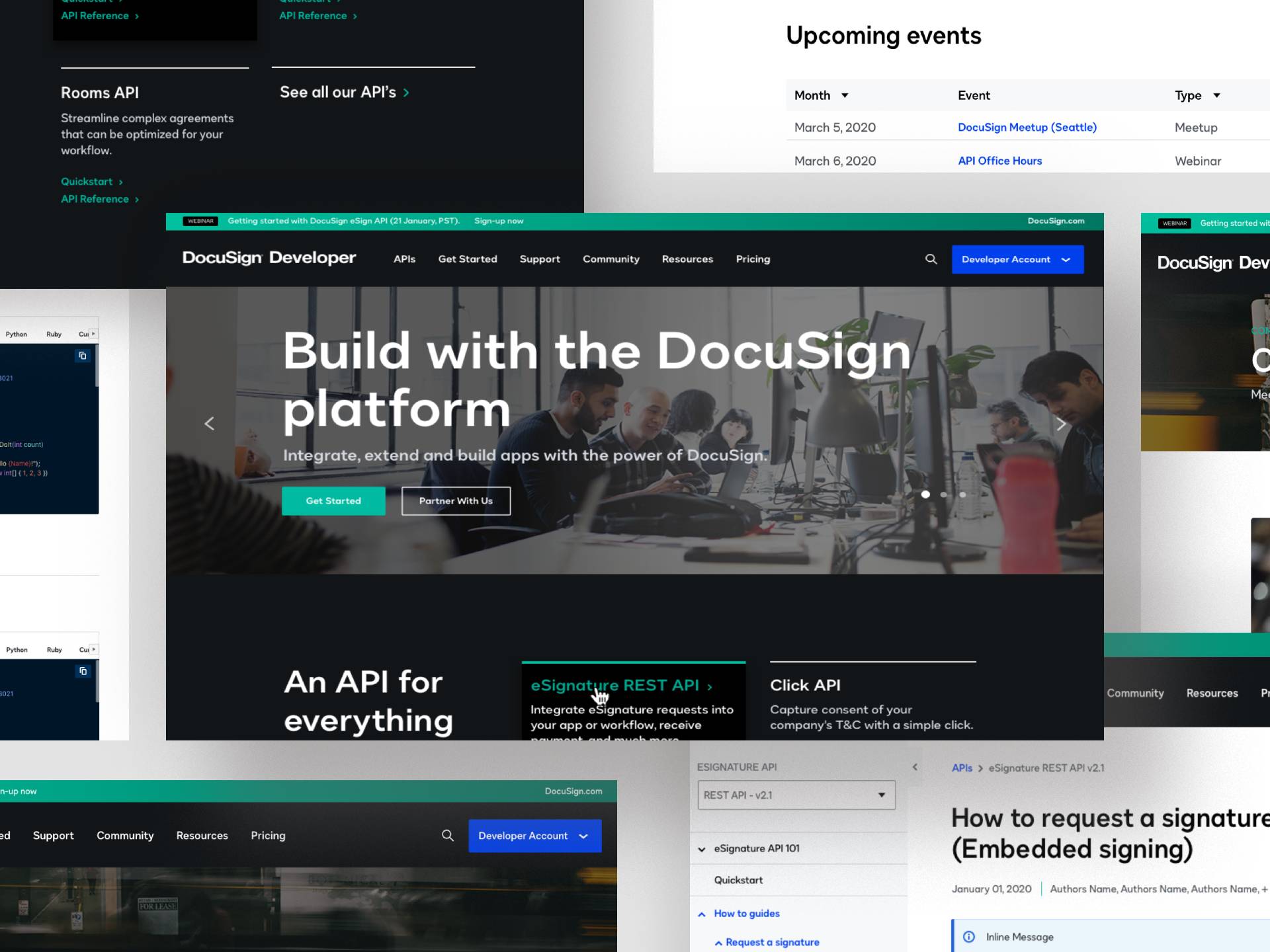
DocuSign is one of the world's leading digital transaction platforms, helping organisations collect electronic signatures and manage document workflows at scale. Their Developer Center is the gateway for engineers integrating DocuSign's API into their own applications — a high-traffic, technically complex resource serving a developer audience with low tolerance for navigation friction.
THE CHALLENGE
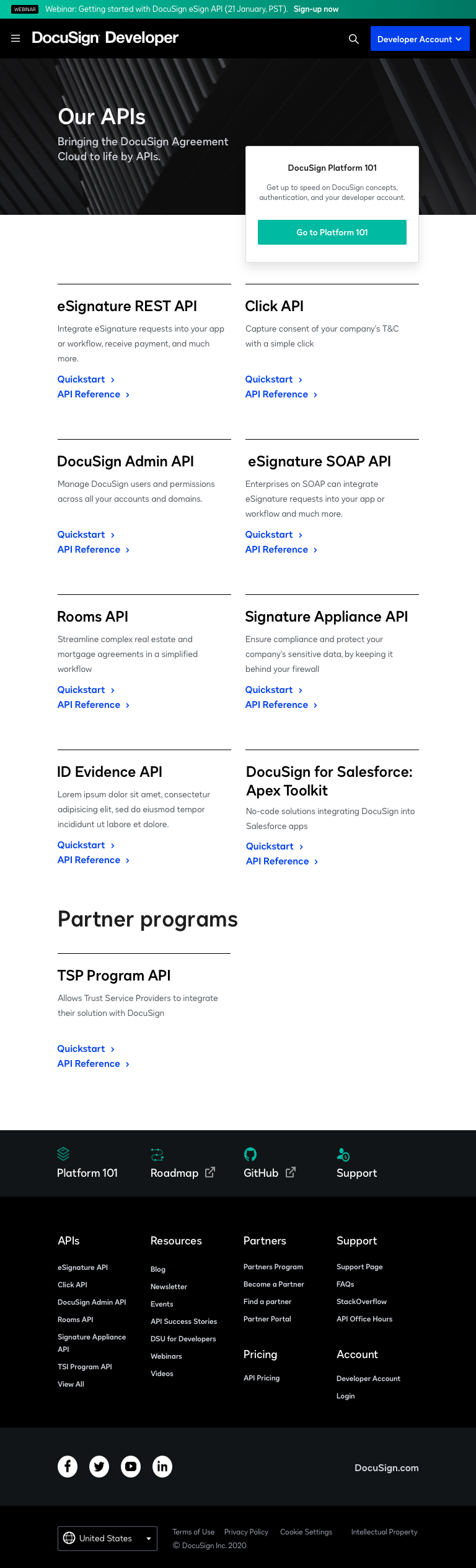
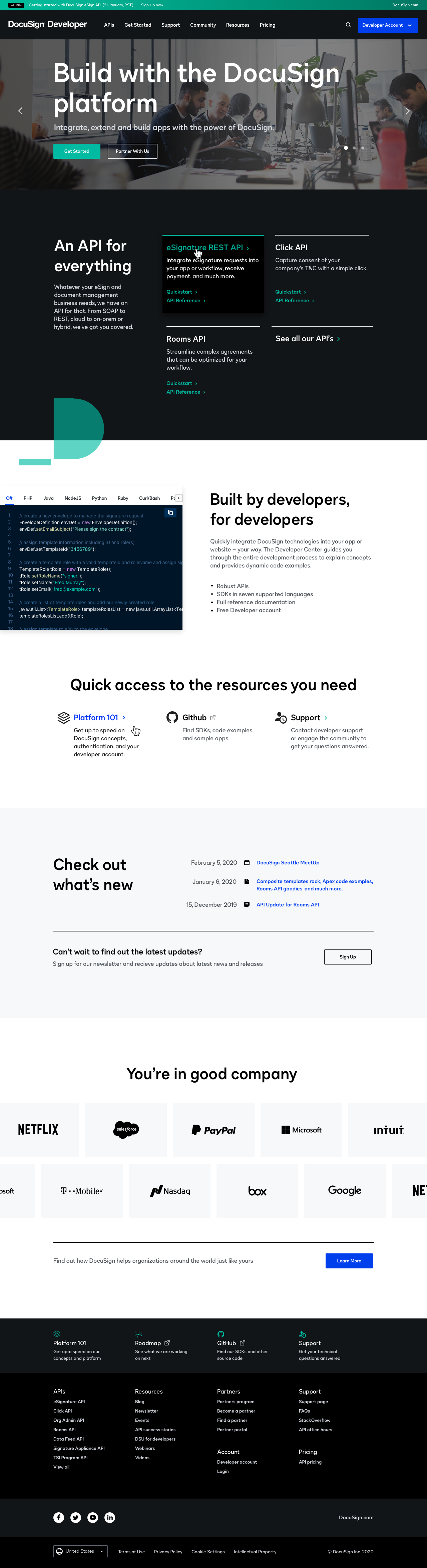
When I joined the team, the DocuSign Developer Center had a fully designed desktop experience but no mobile or tablet equivalent — and no mobile component library to build from. The lead designer had taken an unexpected leave, and the project was already running. I had to ramp up fast: understand the existing design system, identify what was missing for responsive breakpoints, and start delivering without slowing the team down.
The documentation pages added a second layer of complexity. They explained how to implement and manage the DocuSign API — dense, technical content with deep navigation hierarchies. On mobile, page titles were truncating and entire sections were being missed. The information architecture that worked on desktop collapsed on smaller screens.


THE PROCESS
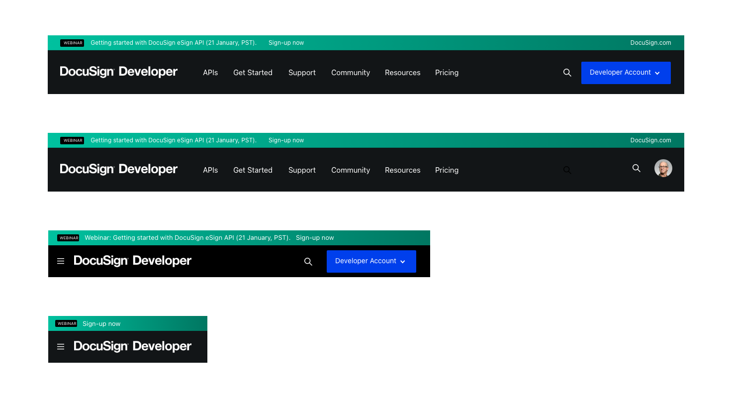
I started with a component audit across the existing desktop system — cataloguing what existed, what was missing for mobile, and what would need to be built from scratch. Rather than designing every screen individually, I built a mobile component library first: navigation, footer, buttons, typography scales, tap targets, and form elements adapted to the physical constraints of touch interaction.
Starting with shared components meant every screen I produced after that was consistent and fast. Navigation and footer alone resolved a significant percentage of the mobile usability issues, because they appeared on every page. From there I worked through the marketing pages and the documentation pages, adapting layouts, refining tap areas, and restructuring navigation hierarchy to prevent the truncation and section-skipping that the existing structure caused on mobile.
THE OUTCOME
The DocuSign Developer Center launched with full responsive coverage across desktop, tablet, and mobile — and a reusable mobile component library that extended the existing design system rather than duplicating it. The navigation restructuring on the documentation pages made complex API content significantly more accessible on small screens, reducing the truncation and context-loss that had been affecting mobile users.
Working under time pressure with an unfamiliar codebase and a design system mid-build required the same skills as any design leadership role: rapid context-switching, clear prioritization, and the discipline to build for reuse rather than speed.