INTRO TO CAPTABLE
CapTable is a premier financial firm specializing in providing tailored financial solutions to startups. With a deep understanding of the unique challenges faced by early-stage ventures, they are dedicated to helping entrepreneurs turn their innovative ideas into thriving businesses. Their team of experts combines extensive industry knowledge with a passion for fostering growth and success in the startup ecosystem. They specialize in funding, strategic guidance, and comprehensive financial planning.
THE CHALLENGE
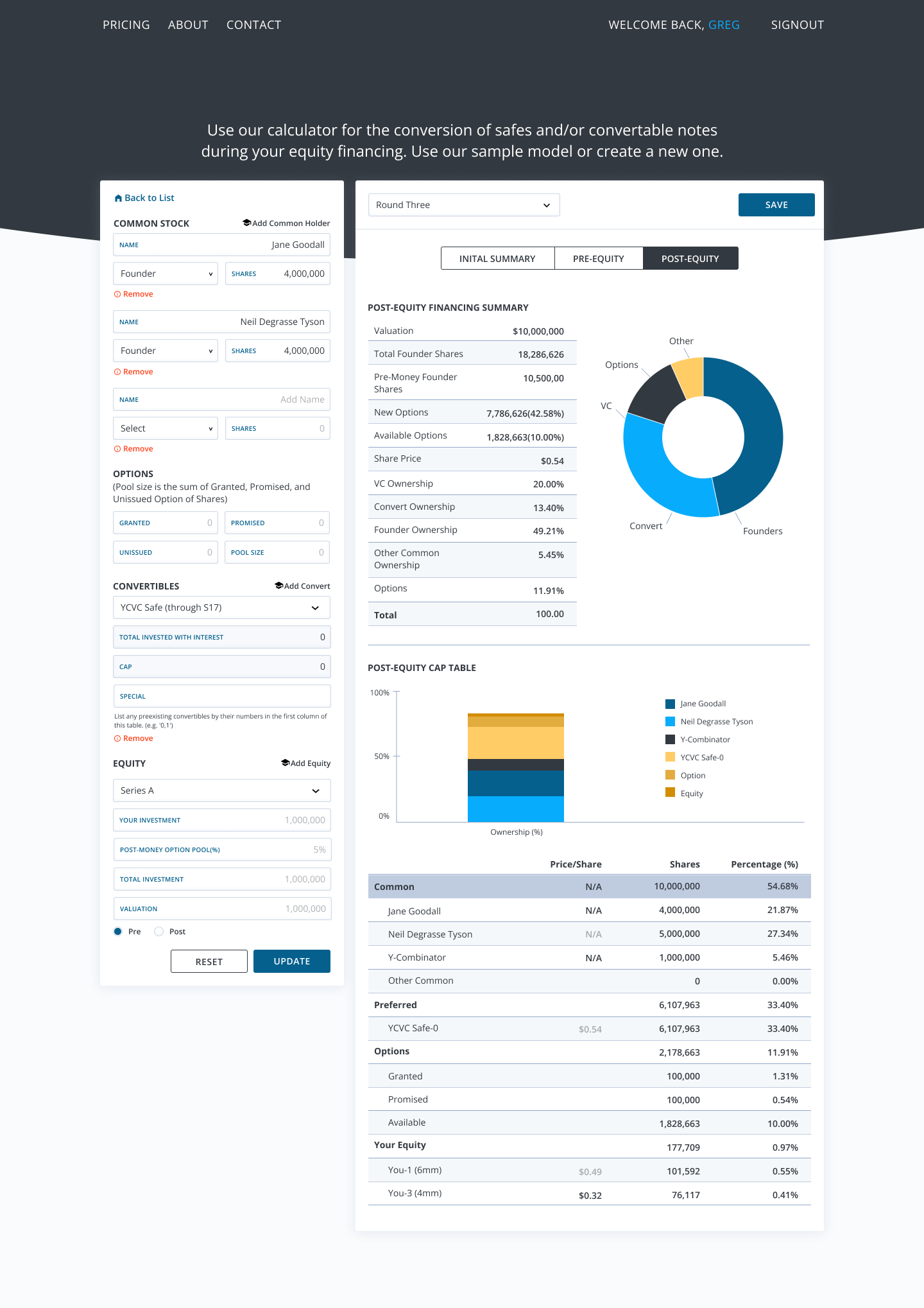
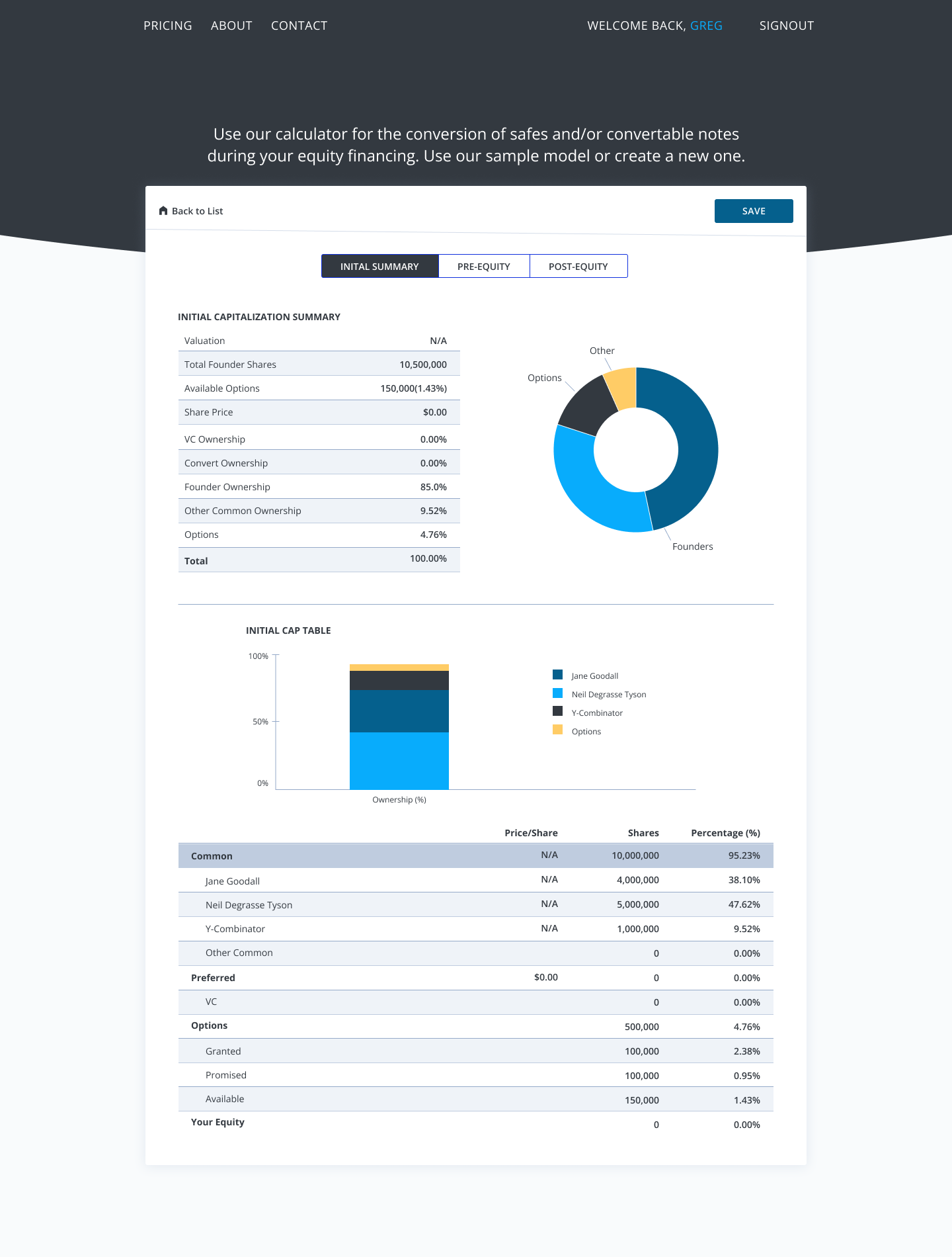
A common challenge faced by founders and early-stage startups is the complexity of breaking down their capitalization table (cap table) during different funding rounds. Understanding the intricacies between Pre-Money Safes, Standard Notes, Custom Convertibles, and the impact on equity allocation can be daunting. Additionally, considerations such as common or priority stock further complicate matters. The challenge at hand was to develop a tool that would visually present the cap table breakdown in a clear and user-friendly manner. The tool needed to automatically update with each new equity issuance and provide educational resources to familiarize users with startup financial terminology. At the start of this project, there were limited calculators available, thus highlighting the need for an intuitive and comprehensive solution.
THE PROCESS
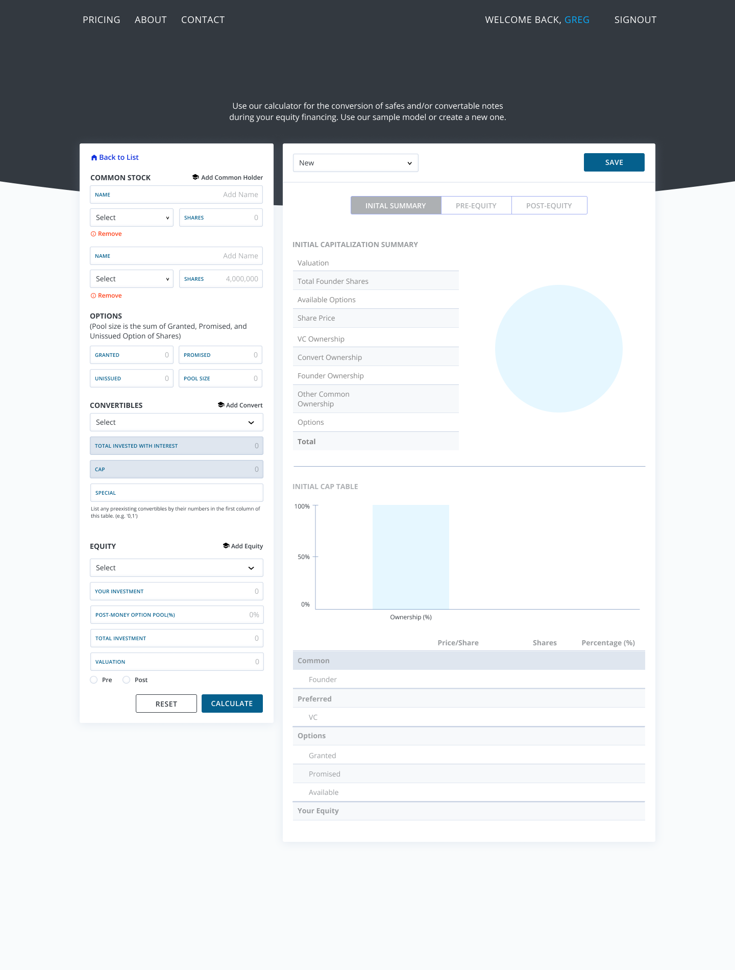
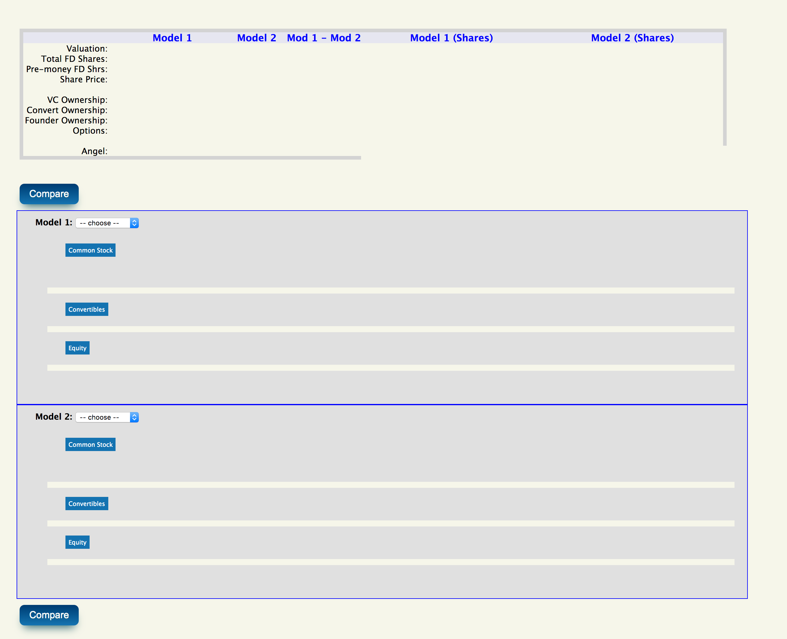
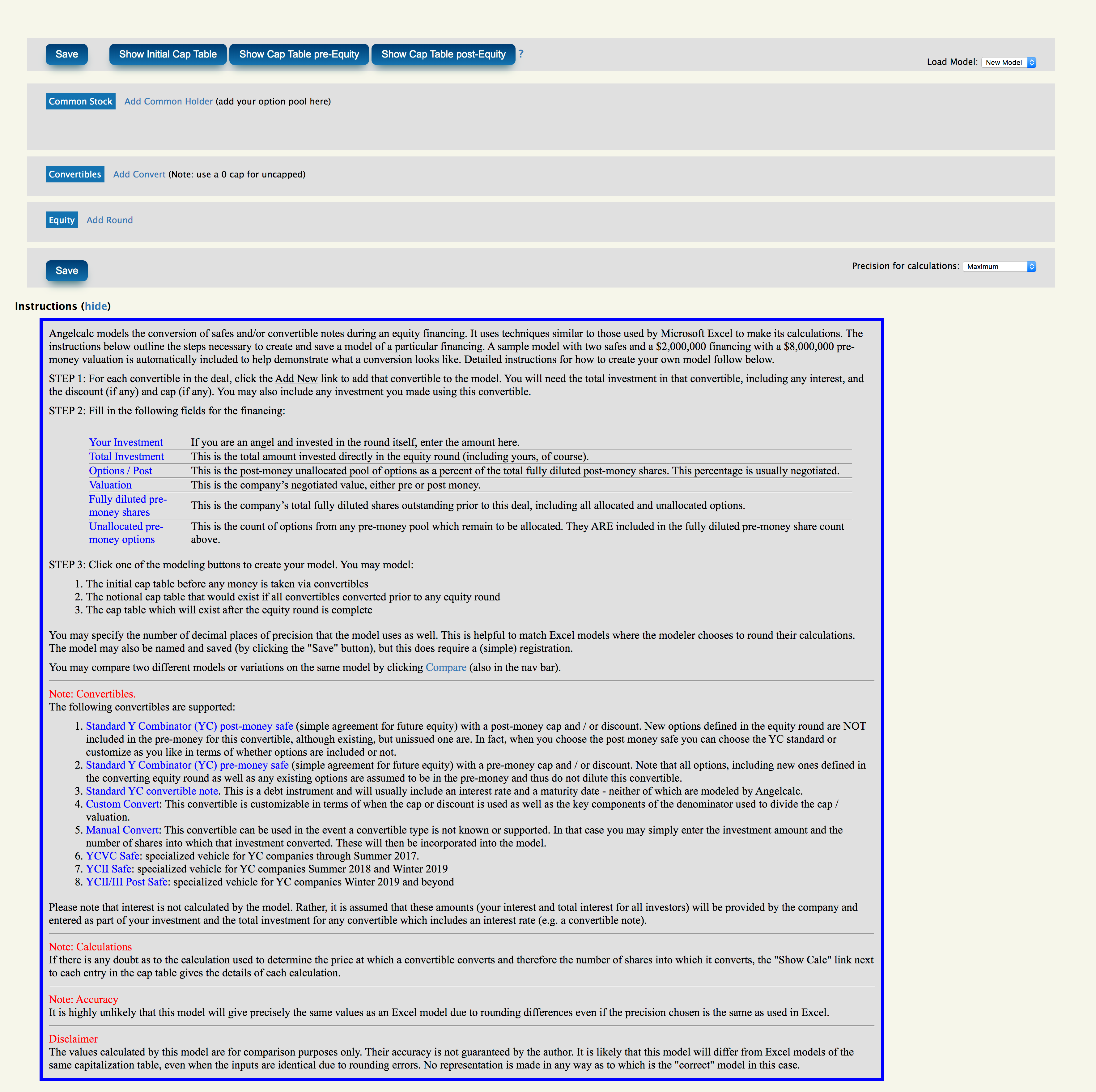
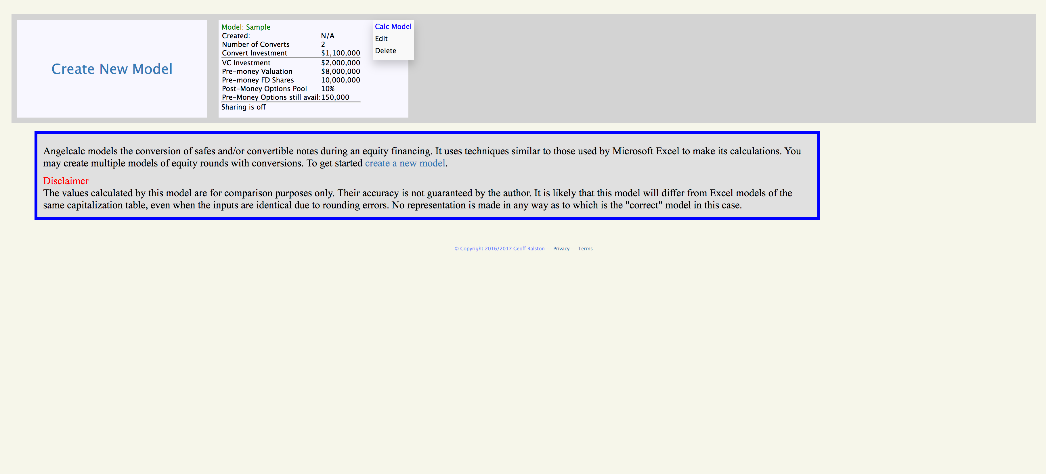
Drawing on my background in financial technology and running startups, I identified the common pain points experienced by founders. To address these challenges, I began by designing the larger overview screens, both in their complete and empty states. It was crucial to consider that not all founders have a financial background, so I prioritized incorporating educational definitions and materials throughout the process. Leveraging my experience in designing onboarding questionnaires, I developed a wizard-style interface to make the process less intimidating. With stakeholder approval, I refined the screens for the questionnaire, breaking down the process into three easy-to-follow steps that mirrored the overview screens. To validate the usability of the tool, we conducted initial user feedback sessions with founders, making adjustments based on their input before moving on to high-fidelity designs. Finally, we ran additional user tests using a clickable prototype to further fine-tune the experience before handing off the design to the development team.
THE OUTCOME
Although the project was initially slated to last 1-2 weeks, it was cut short due to budget constraints imposed by the client. Nonetheless, I take pride in the substantial progress we were able to achieve within the limited timeframe of 1.5 weeks. The work completed showcased the team's dedication and expertise in addressing the specific needs of founders and early-stage startups. While the project may have been prematurely concluded, the screens are a testament to simplifying complex financial processes and empowering entrepreneurs on their startup journeys.
