PROJECT OVERVIEW
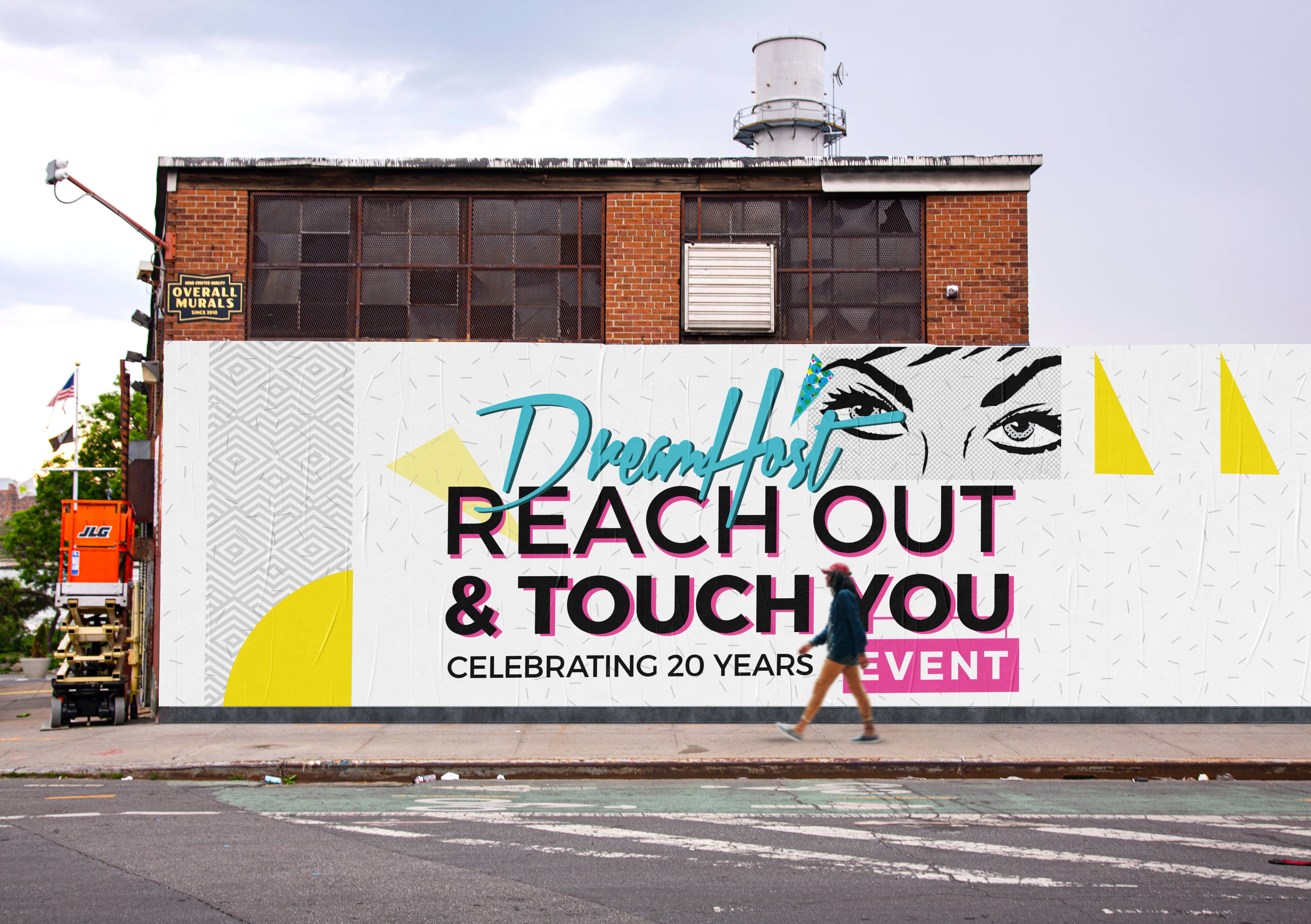
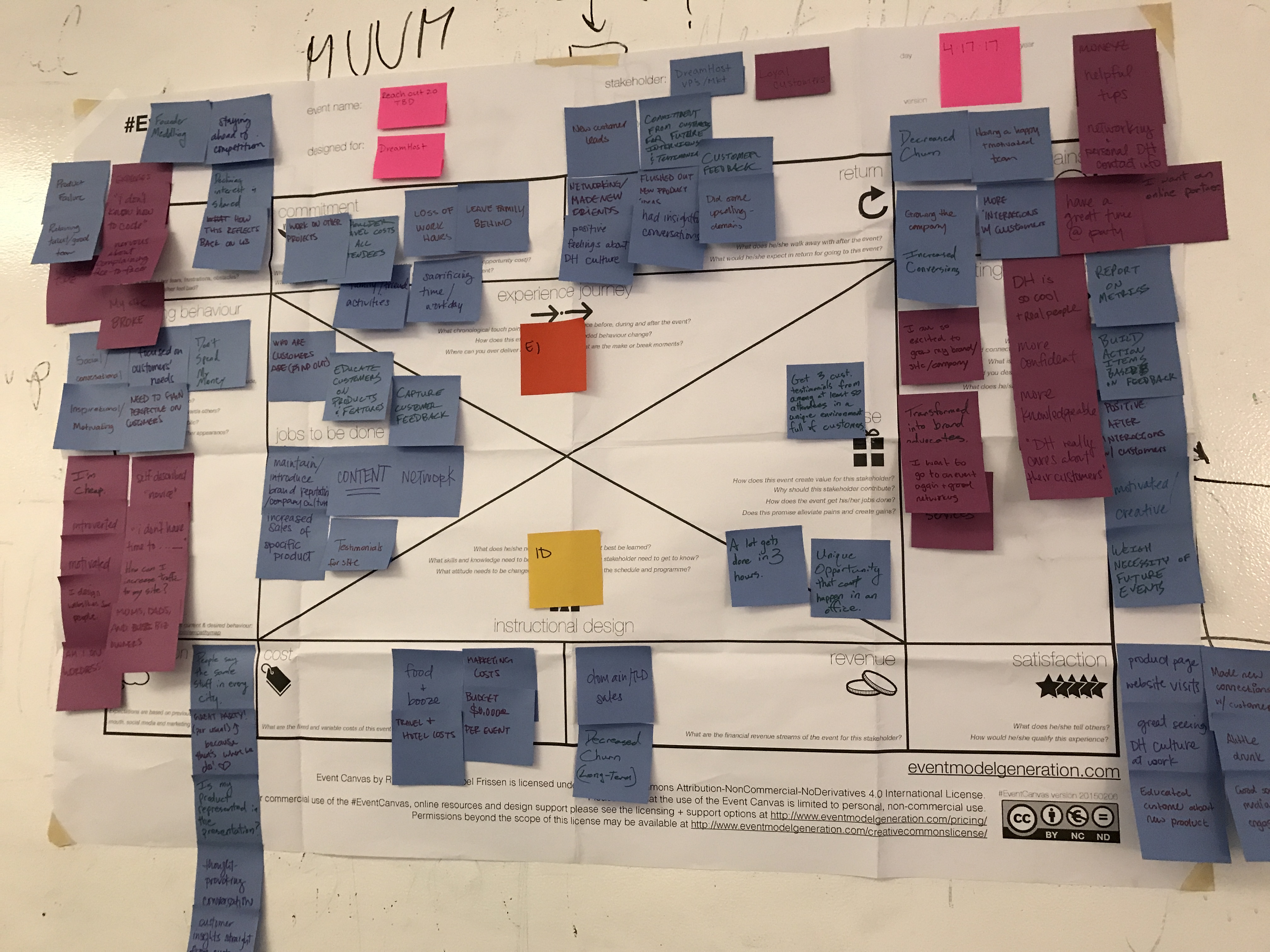
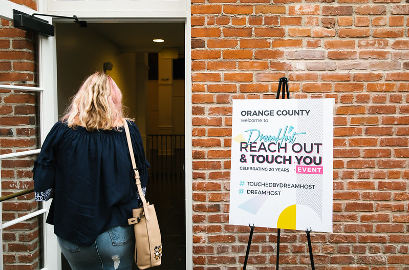
DreamHost does a yearly tour around the country to meet with their customers. This is a great way for face to face interaction with the people who use our products. It facilitates some honest feedback over shared appetizers and alcohol. This year we decided to update the format, that would encourage people to come out and hopefully learn something new. We set up 5 different round table discussions in each city for our customers to join, on a variety of different topics. Topics included branding, user experience, SEO best practices, and how to own your digital presence. 2017 was extra special because it was the 20th anniversary of the company being in business. No small feat for a web tech company.
THE CHALLENGE
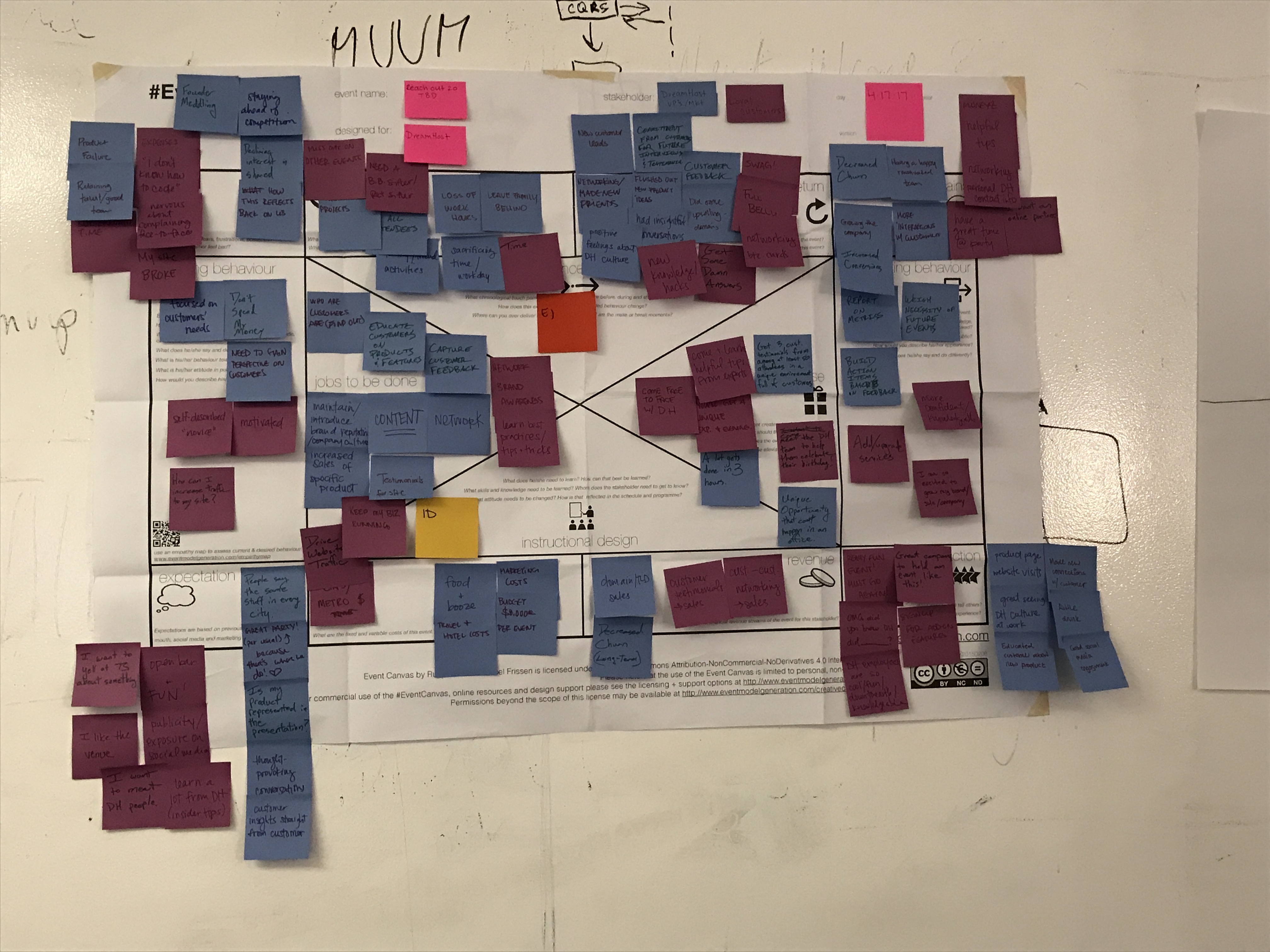
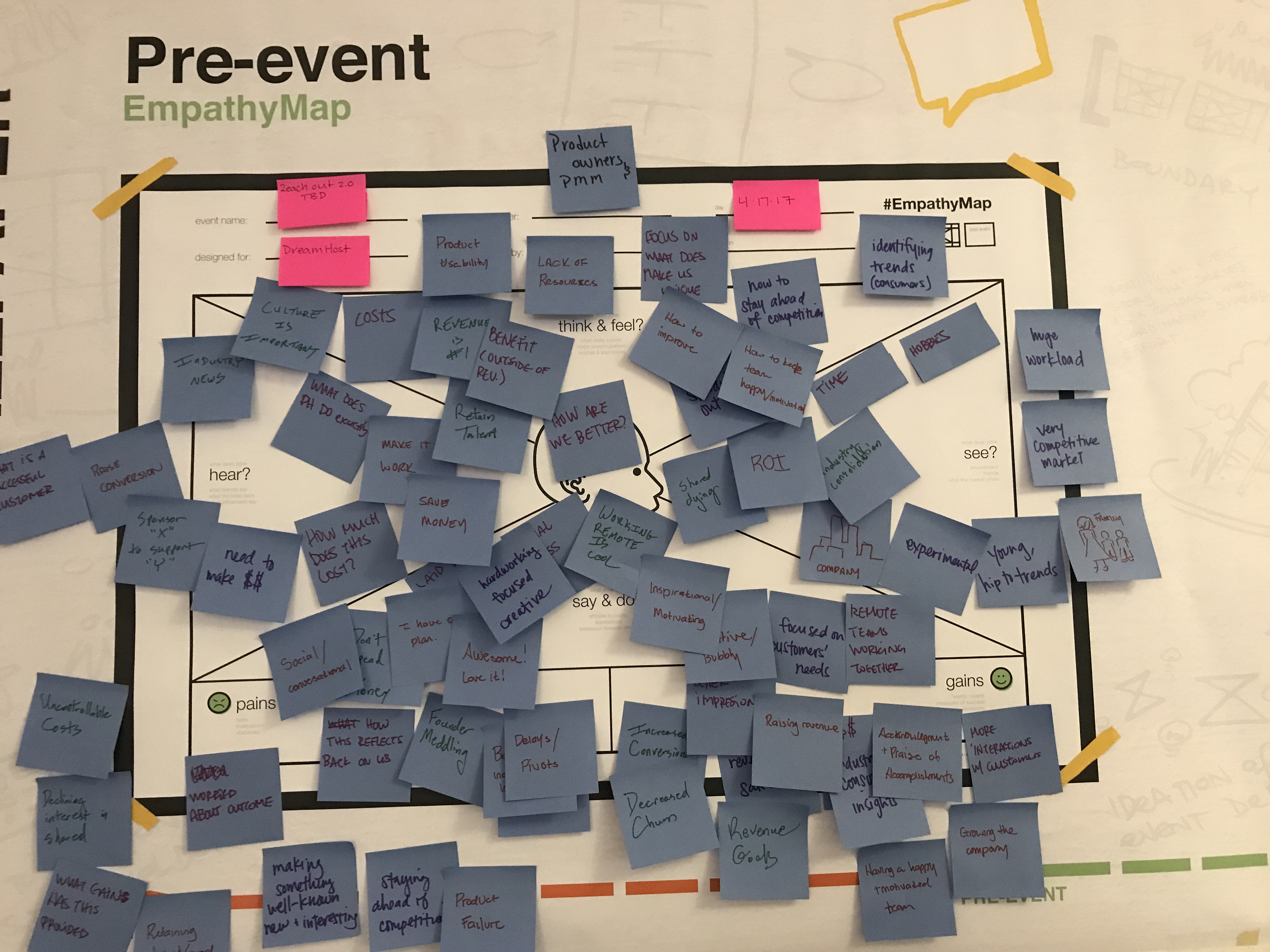
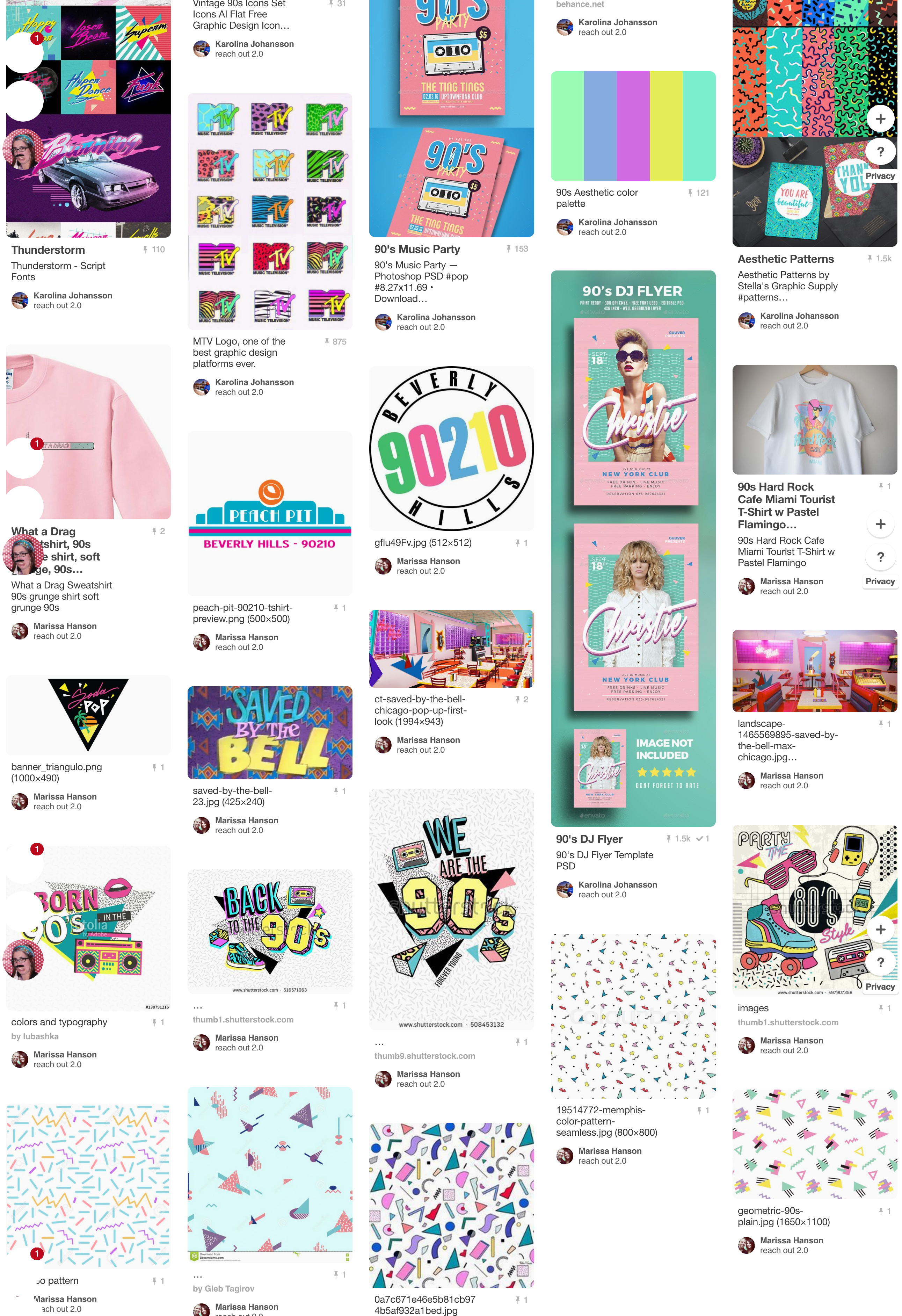
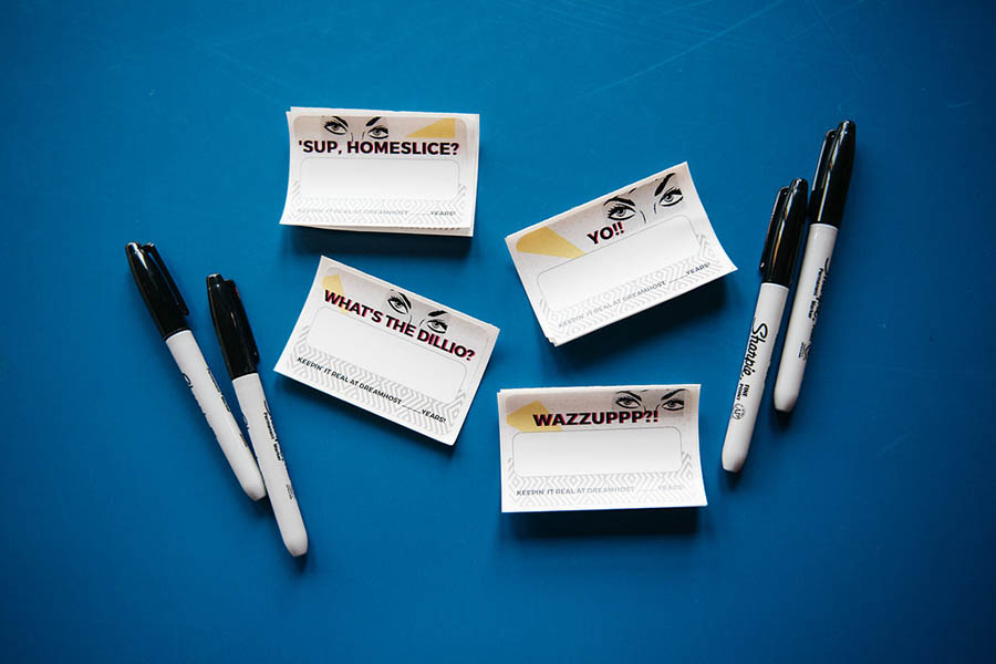
The goals of the project were to come up with a design that worked for a fun upbeat company event and help celebrate the twenty-year mark. We pulled inspiration from the late 80s and early 90s when graphic design was very playful and colorful. The event would reminisce about the years passed and poke fun at the glory days of floppy disks, AOL, and beepers. We set project goals and takeaways for our team to help us stay on target.
GOALS FOR OUR TEAM
- Gain feedback on our products and support.
- Engage + attract potencial new customers
- Attain current customer testimonials + endorsements to use in our marketing collateral.
TAKEAWAYS FOR OUR CUSTOMERS
- Resolve technical support questions and issues.
- Learn something new about DreamHost’s products.
THE SOLUTION
Looking at the inspiration I loved the loud use of colors, playful use of typography and wanted to make sure that was something that came through in the design. People were still coming out of the haze of the 80s and the rise of desktop publishing on computers made people come up with some pretty wacky/risky stuff. The era makes me think of David Carson and Paula Scher.
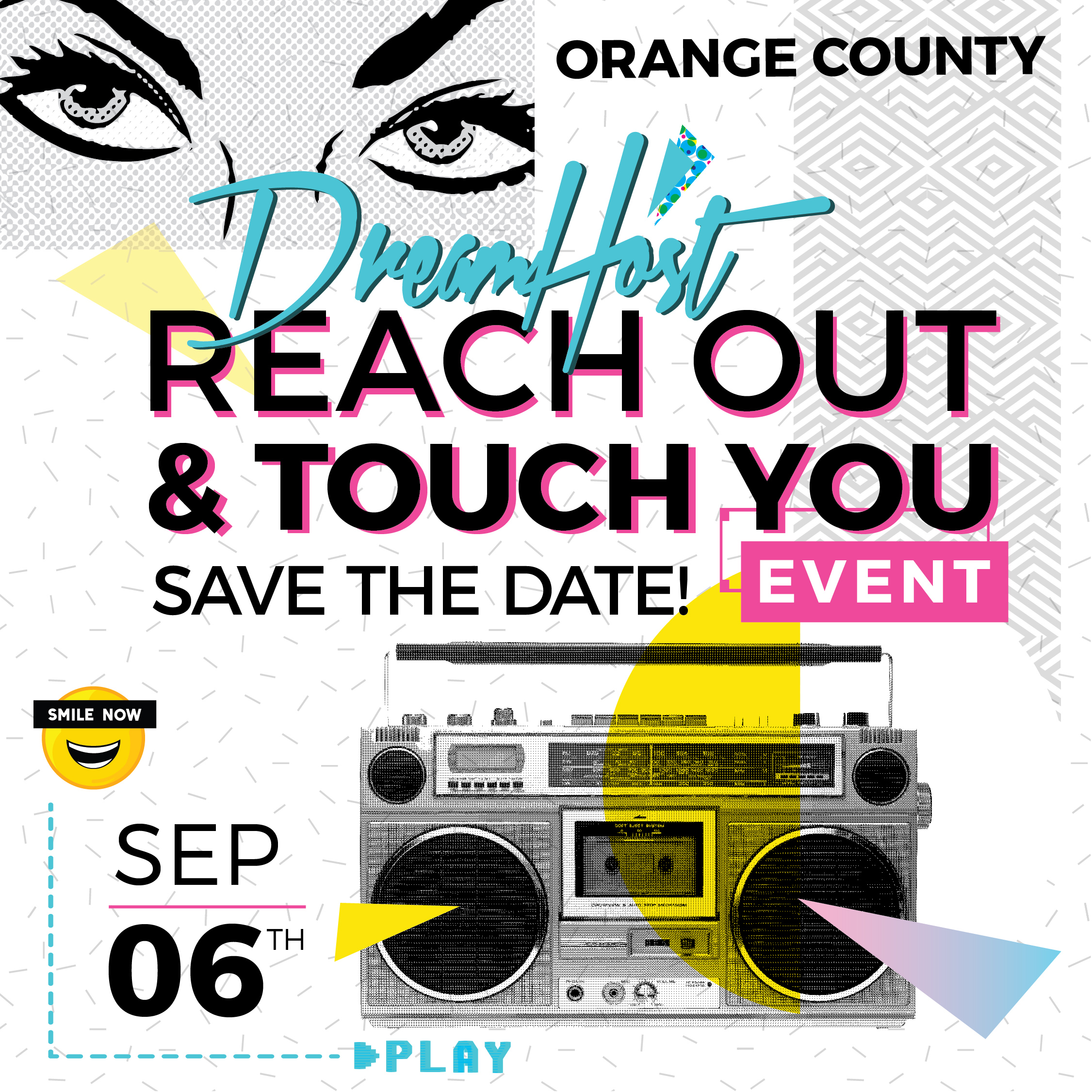
The solution became an upbeat visual interpretation of the 90s and appropriating it to today. We stayed away from the gritty alternative look we sometimes relate back to the 90s and made it lighter. More MC Hammer and a little less Nirvana. The event campaign launched Aug 2nd with our event landing page, following with a series of social posts, and emails.
THE TAKEAWAYS
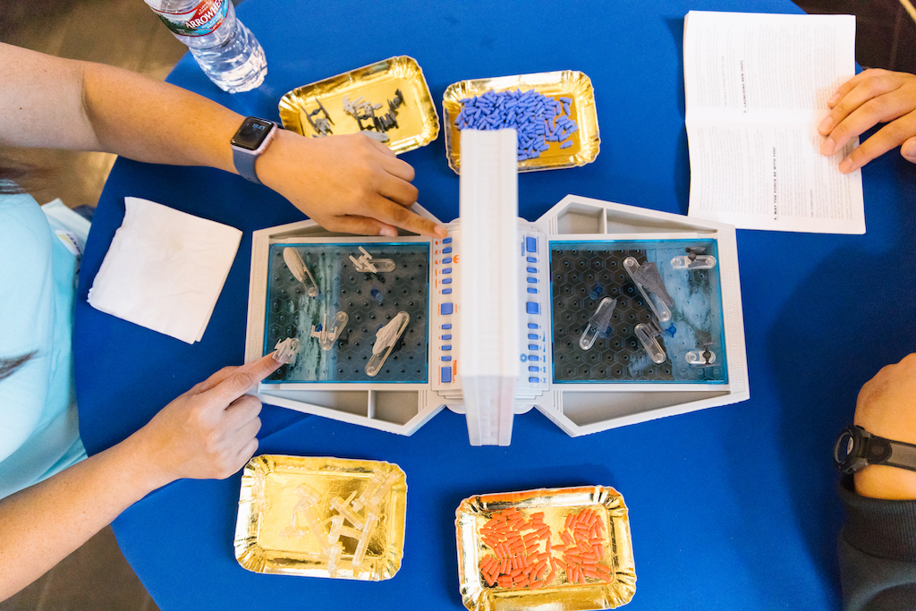
The project was a nice challenge because it was a drastic difference from the typical DreamHost brand. The project was a joy to work on since it was a trip down memory lane for myself as well growing up in the 90s. The theme ended up being a fun conversation opener with a lot of customers how the web has changed and evolved for them. The turn out for the events varied between 40-50 people. The round table format ended up being a success, with folks sitting around debating long after the time allotted was over. Customer bonded over board games of Star Wars battleship and DreamHost branded cupcakes.
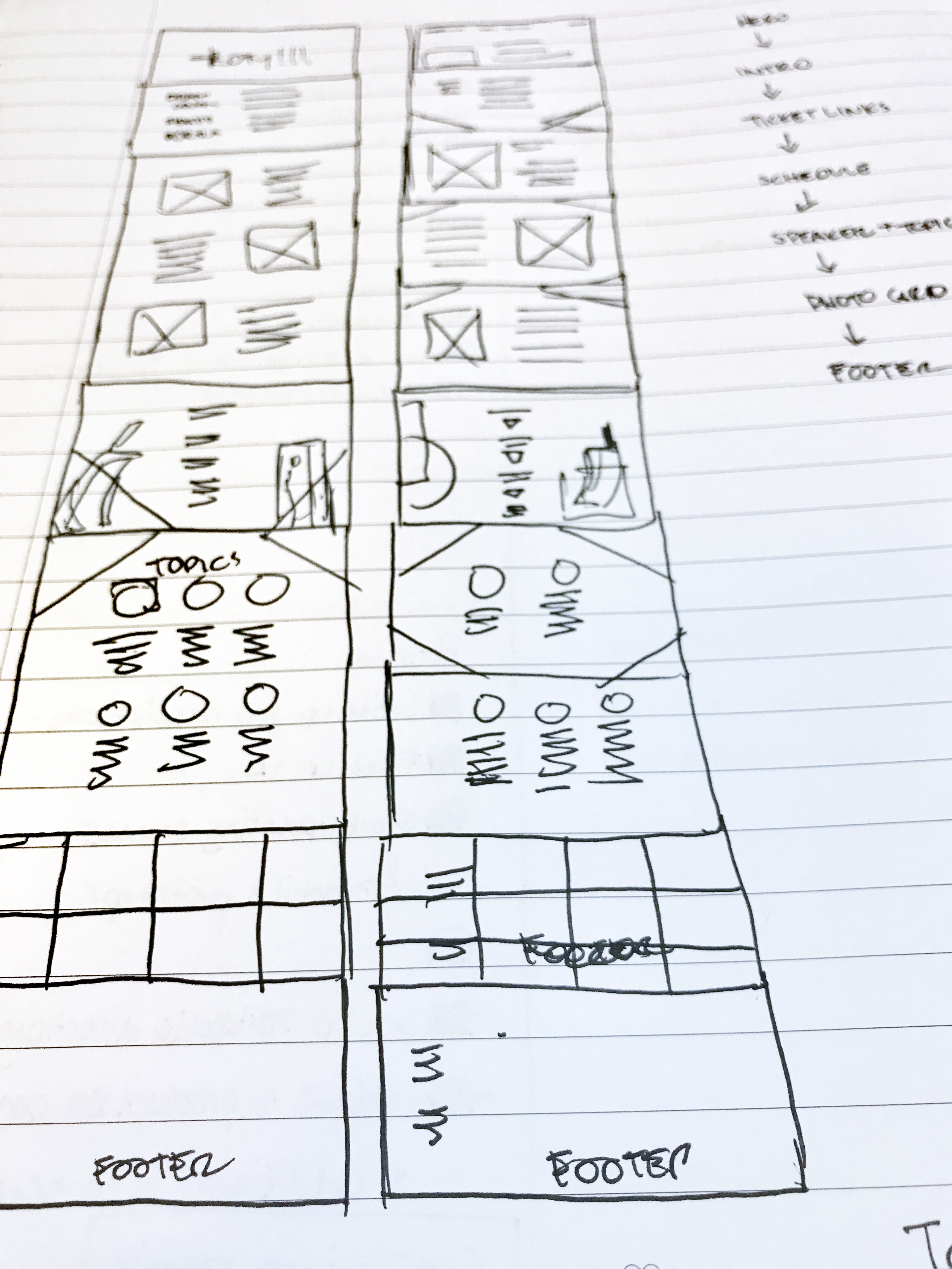
EVENT SITE DESIGN

